Zencity
Engage: Redesigning Builders (Project Page)
OVERVIEW
Zencity is a data analytics company that focuses on assisting local governments in gathering insights from residents to make informed decisions. Engage is a tool on the platform that empowers local government officials and city leaders to interact with residents, collect feedback, and gain a deeper understanding of the community's needs and preferences through various functionalities. These include resident-facing project pages, engagements (surveys), discussion boards, and public boards.
For the project builder, one of the challenges we aimed to address was a decline in adoption since Engage joined Zencity. Based on prior feedback we recognized that some clients felt overwhelmed when embarking on the journey of creating and launching their first project page. Clients have also expressed the need for diverse content types, such as image galleries and embeds, along with a request for more flexibility and control when crafting a resident-facing project page.
ROLE & DURATION
Lead Product Designer (Engage)
6 months
Status: Development
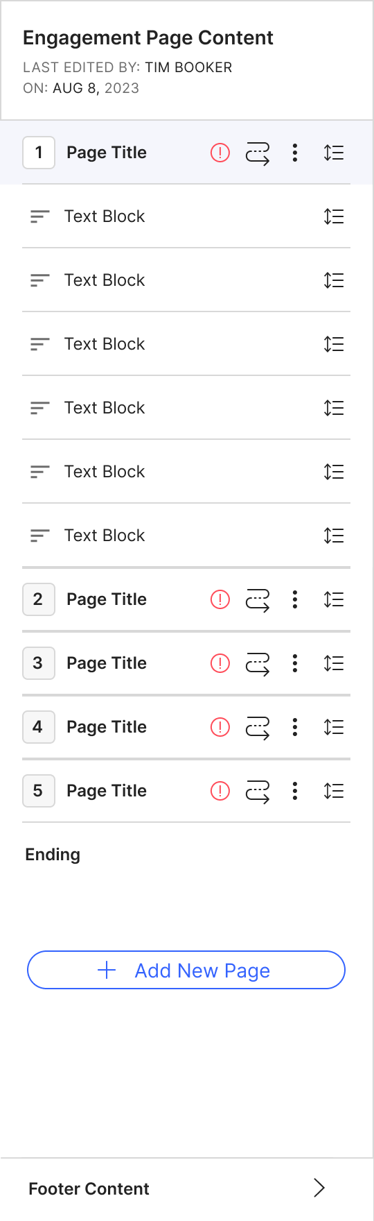
Legacy - Project Builder
CHALLENGES
- Decline in adoption since Engage joined Zencity.
- Lack of discoverability for some of the less used tools on Engage (Engagements, Discussion Topics and Public Boards).
- Clients expressed feeling overwhelmed when creating their first project page.
- Clients requests for diverse content types and added flexibility.
The Process
Researching | Ideating | Validating & Iterating | Deciding & Building
I started the design journey with extensive research and exploration, leveraging any existing insights. Collaborative brainstorming with the Director of Product fueled the ideation phase, leading to medium-fidelity designs (Usually I like to start off with low/medium fidelity first). Early concepts were shared with the product team, and feasibility assessments were made in collaboration with developers. Achieving alignment, I seamlessly transitioned to client feedback interviews for validation and iterative refinement. Concluding the design phase, I delivered finalized mockups to the development team, accompanied by comprehensive feature spec documentation. Every feedback and necessary adjustment were meticulously documented and communicated for seamless implementation.
Researching
APPROACH
I initiated research, exploring the design approaches used by other products and services related to creating a project page or engagement. Before delving into opportunities identified through competitive analysis, it's crucial to note that our goal was not to create a website builder and focus on the simplicity and needs of building a project page. To emphasize this, I established a key design principle: never sacrificing simplicity for feature richness. From my research, there were a few improvements that I thought could be made:
Segregate settings into a distinct tab with consistent language for building
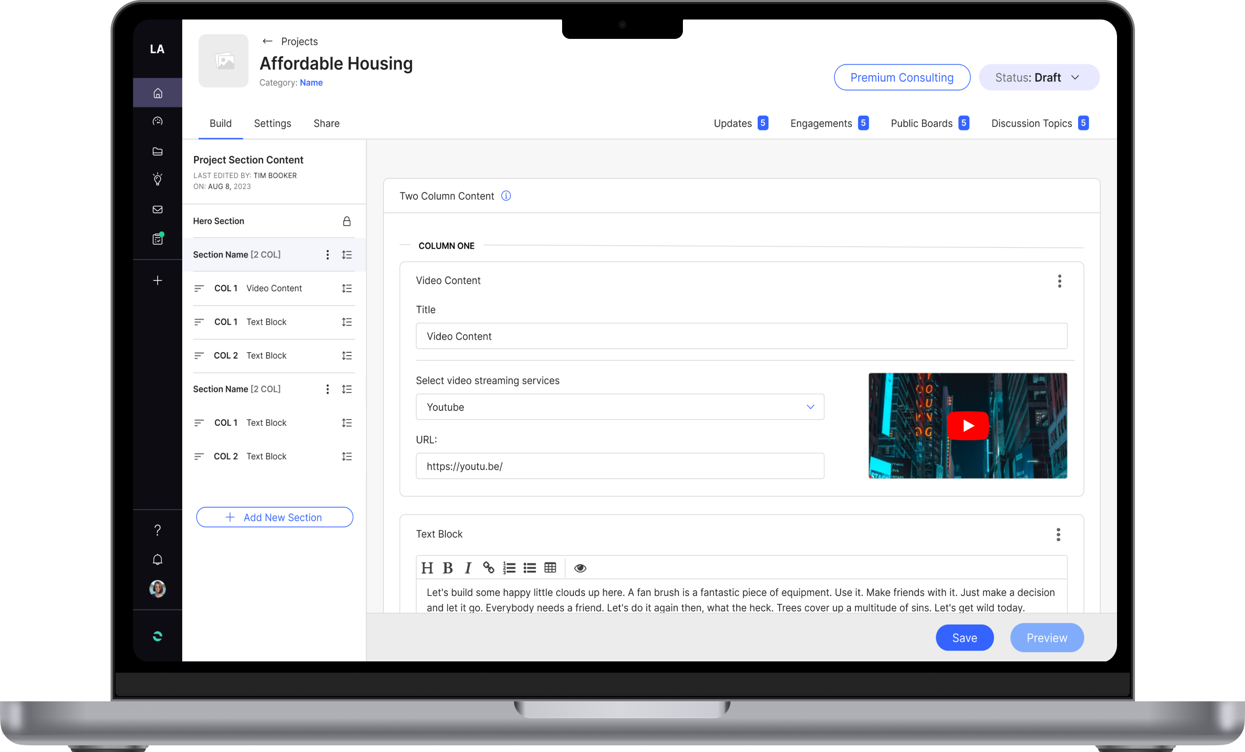
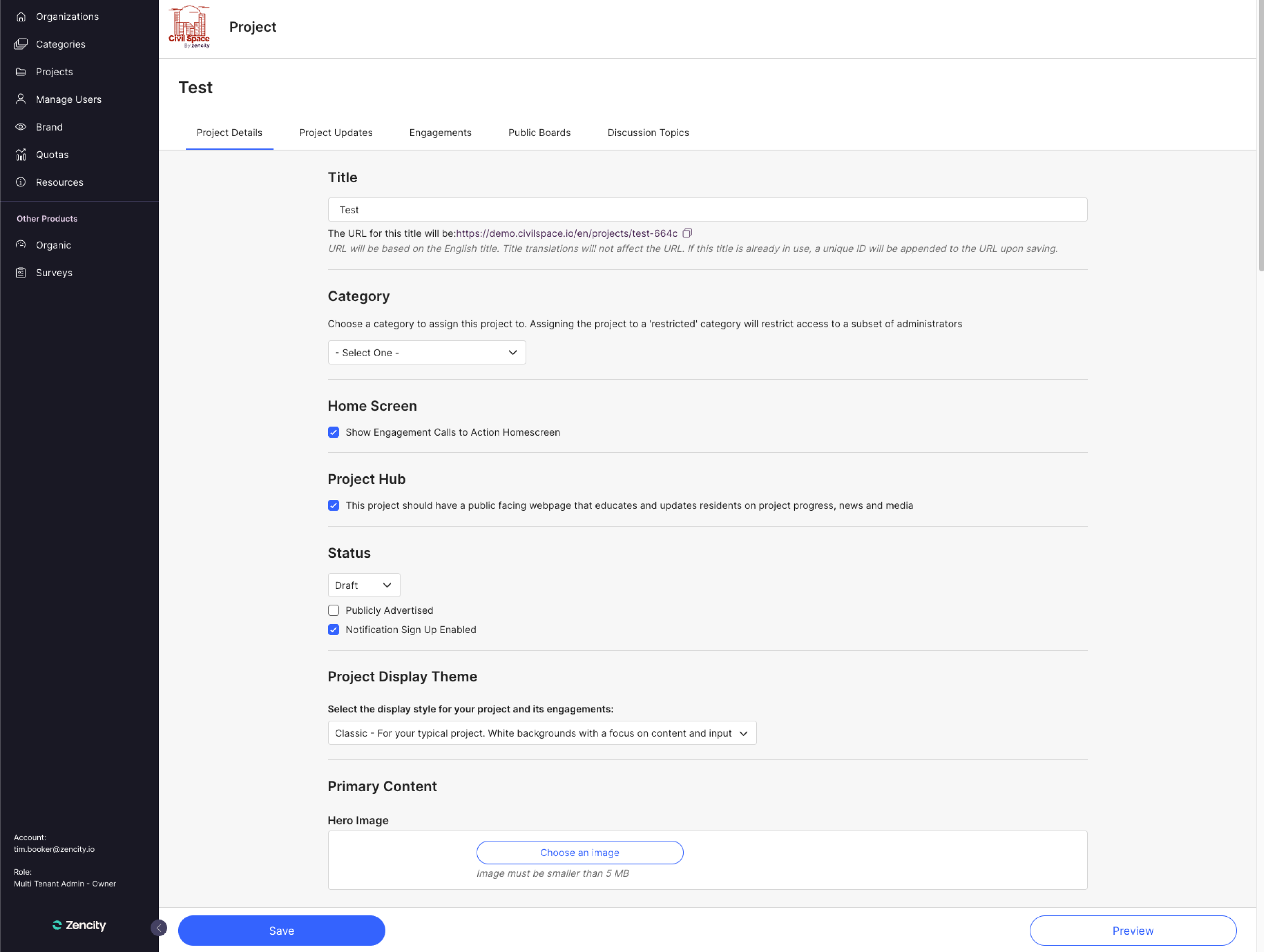
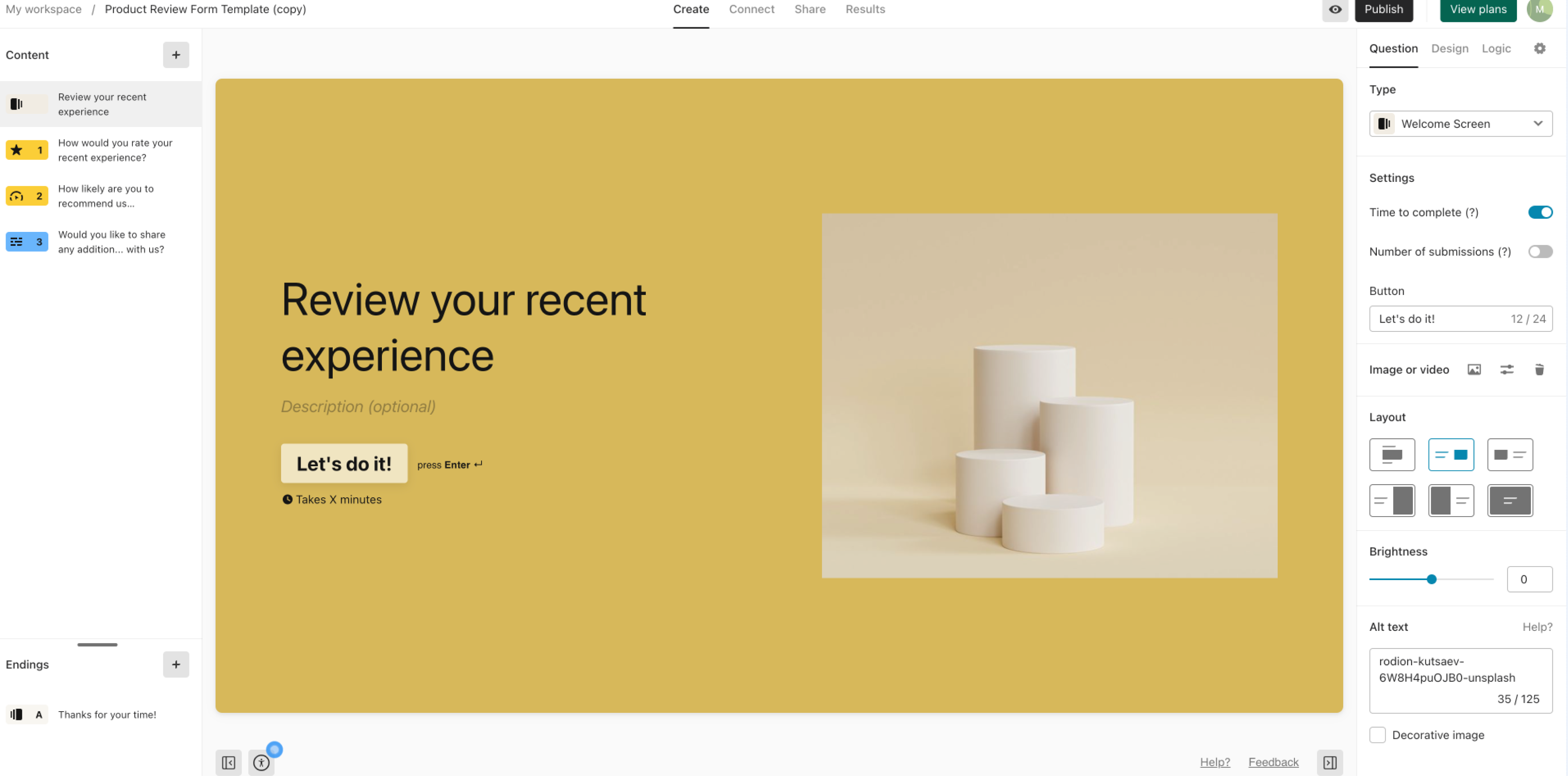
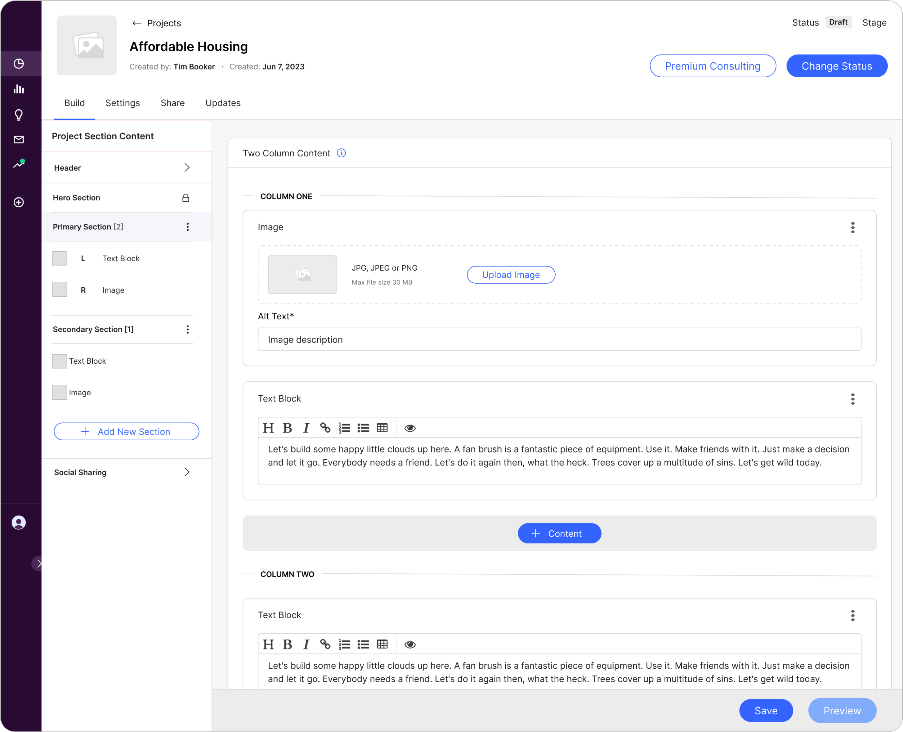
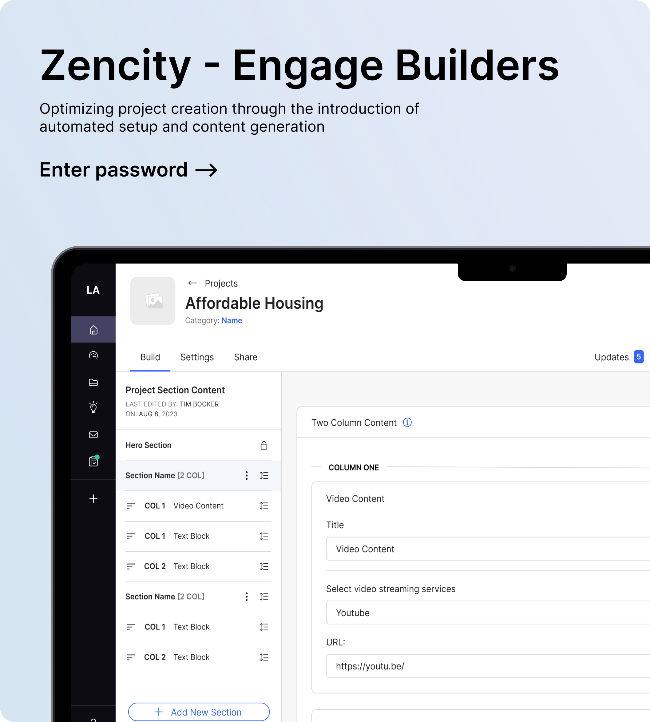
In our legacy design, all elements, including title, content, settings, and options, were consolidated on a single page.
Add Navigation for Content & Sections
Previously, the builders lacked a quick navigation method to access different sections or content on the page. Notably, the Engagement builder differed from others as it was the only one featuring a side navigation and using pages instead of sections. By making a more consistent navigation we could reduce cognitive load for clients when transitioning to using other Engage tools.
Added Flexibility
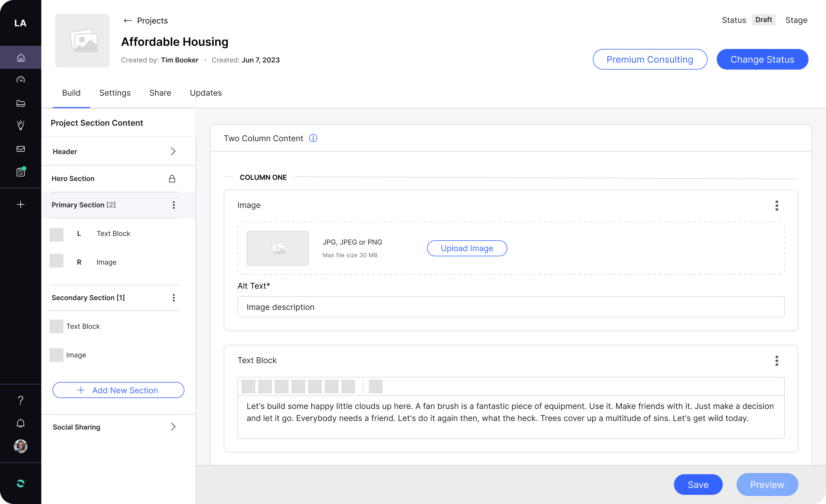
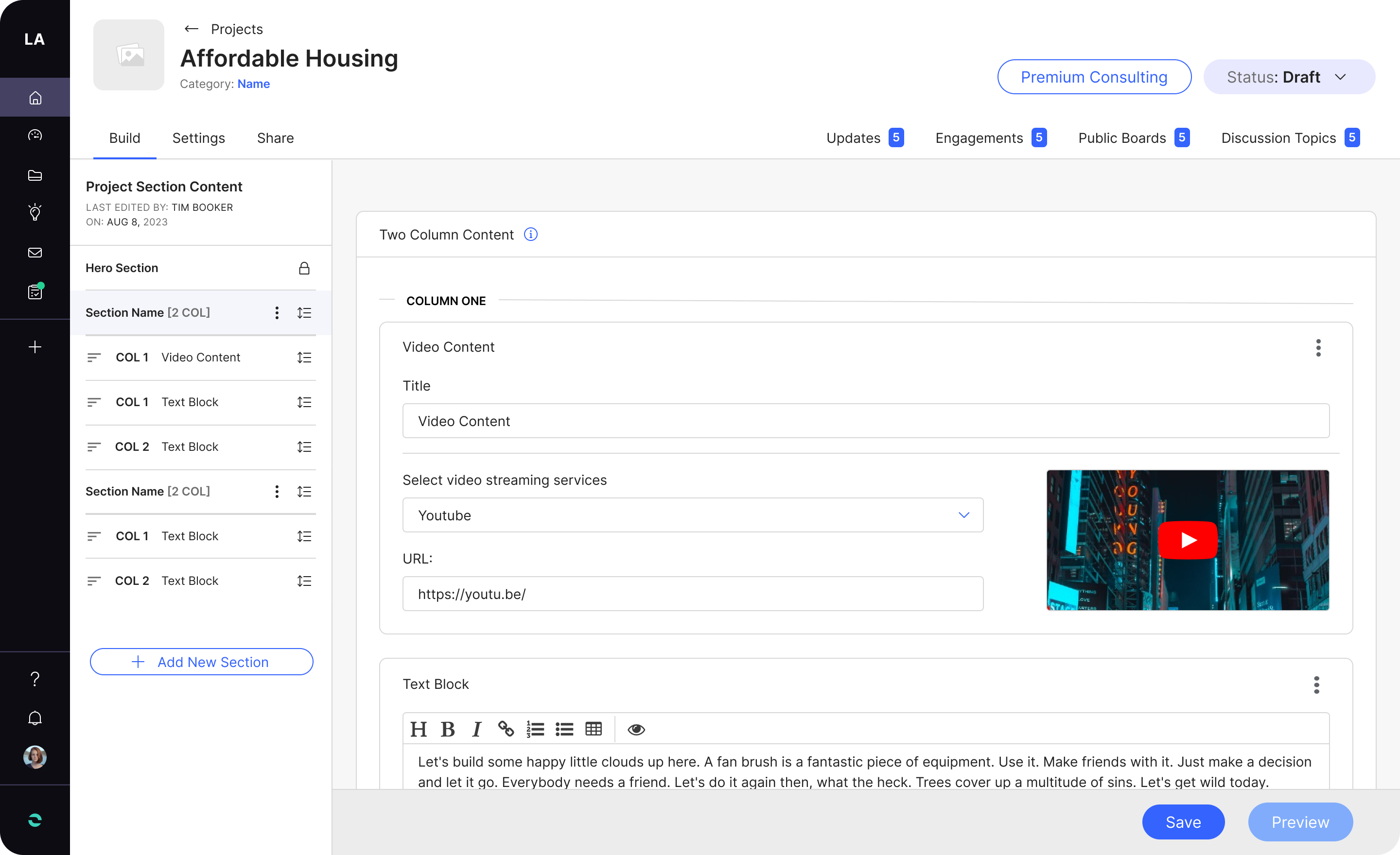
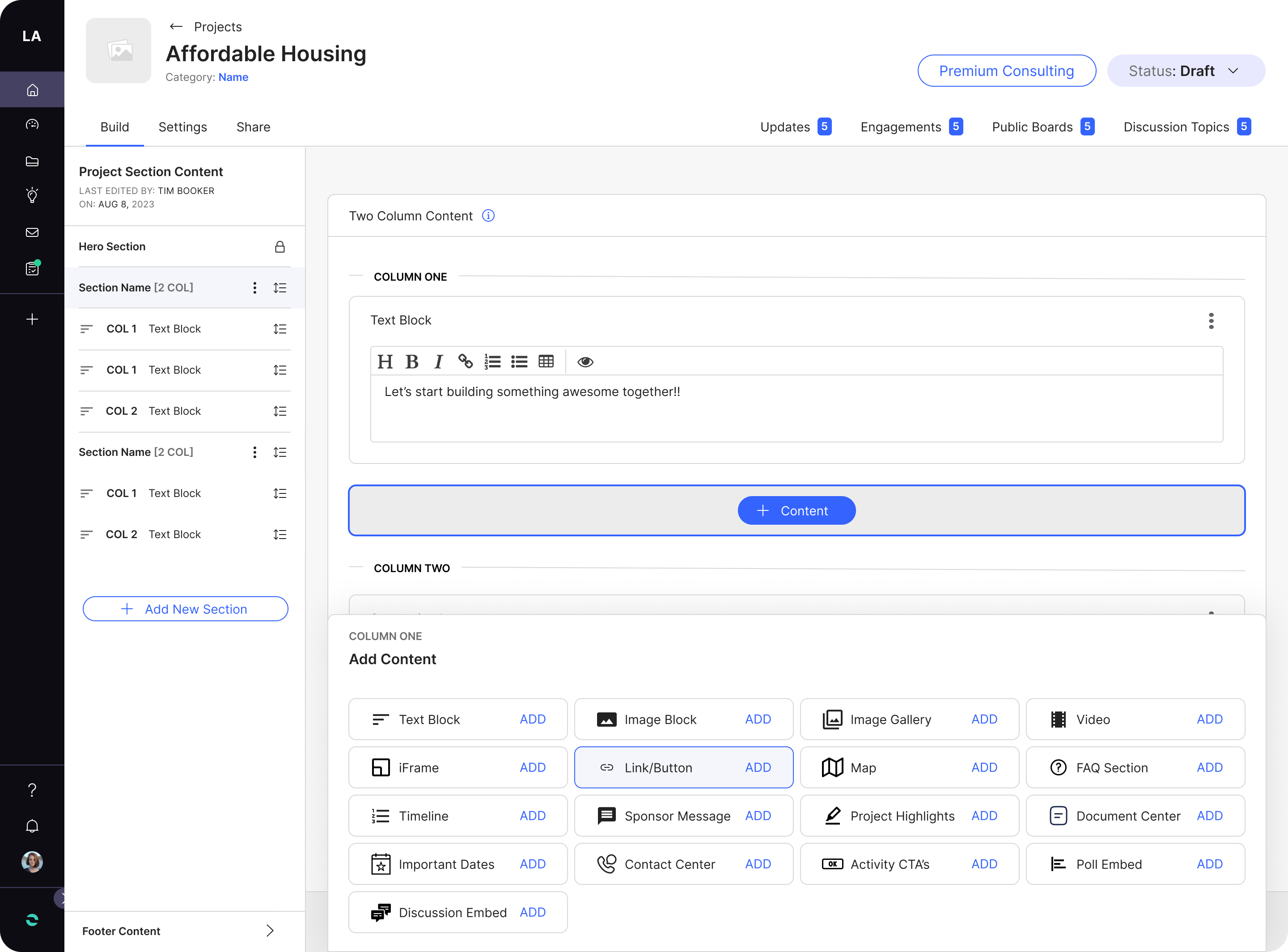
The builders only allowed for single column content and didn’t have the ability to arrange content or sections on the page. Perhaps if we could allow for the option of two column content and be able to arrange different content and sections it would provide more flexibility and control when shaping the project page.
Ideation
When ideating, I often start with hand-sketching wireframes, but in this case, we had a clear vision of what we wanted to build. We aimed for a swift implementation, prioritizing the reuse of components to minimize both development and design time.
APPROACH
- Brainstorming
- Crafted wireframes and shared early concepts
- Created a site map
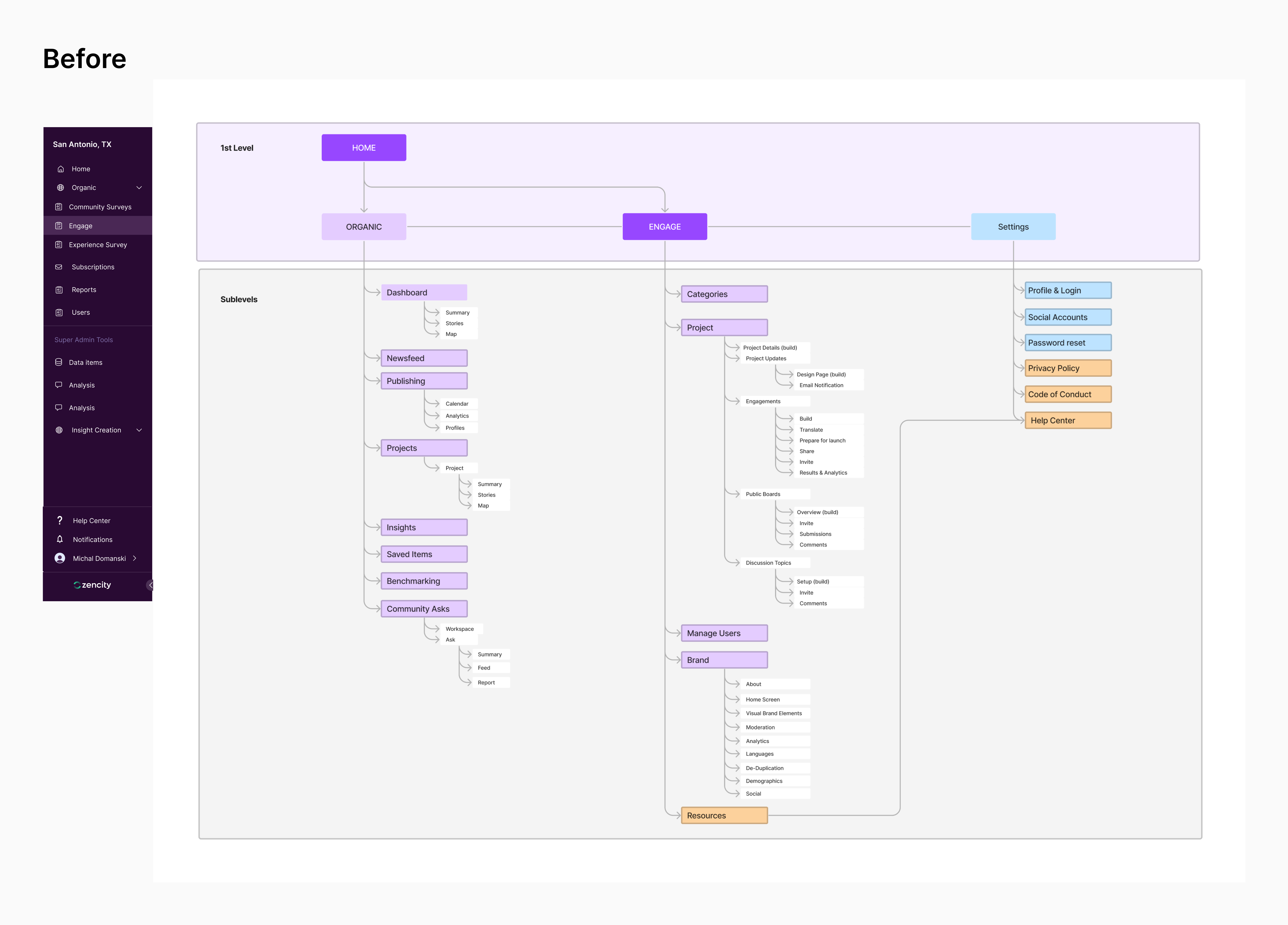
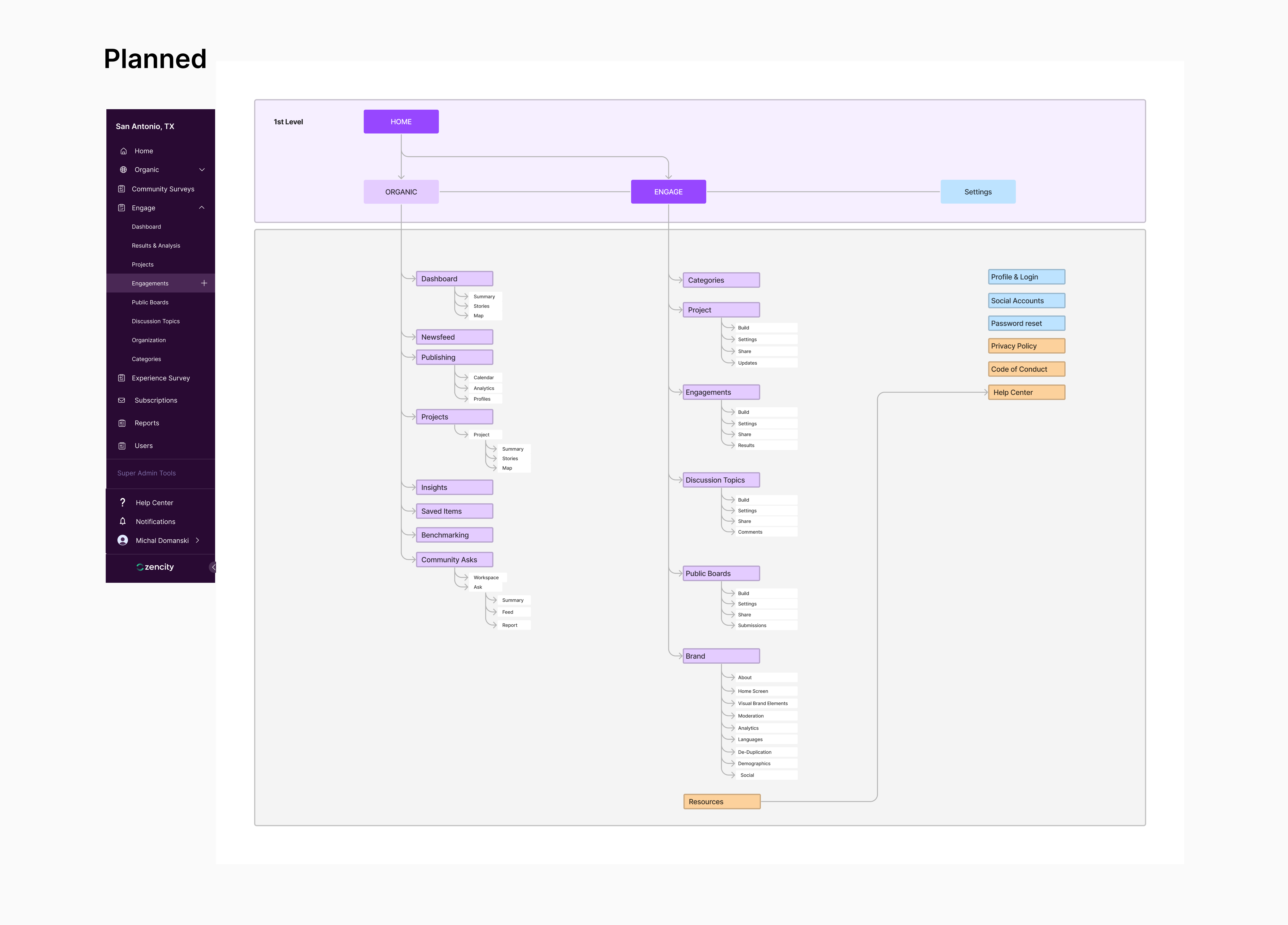
Site Map
Based on the research and previous feedback we received, the Director of Product and I decided to kick off the ideation process by creating a site map, considering one of our primary goals was to increase adoption and discoverability. While constructing the site map, we emphasized maintaining consistency in the navigation for building a project page, ensuring alignment with how it functions for engagements and other activities including a cohesive side navigation.
We also identified an opportunity to elevate global navigation. By seamlessly integrating engagements, discussion topics, and other activities into the global navigation, with the aim to enhance discoverability. This strategic enhancement would allow our users to easily access these features without the need to navigate into a specific project first. Our goal was to encourage exploration and further amplify the discoverability of less-utilized tools. Ultimately, this strategy seeks to catalyze a more comprehensive user adoption on the platform.
Navigation & Consistency
I looked to redesign the build page for creating a project page by exploring options such as presenting all content and sections on a single scrolling page or utilizing in-page navigation and side navigation. This consideration becomes especially important when thinking about engagements that use pages instead of sections, as they are the only ones that have side navigation for the build page.
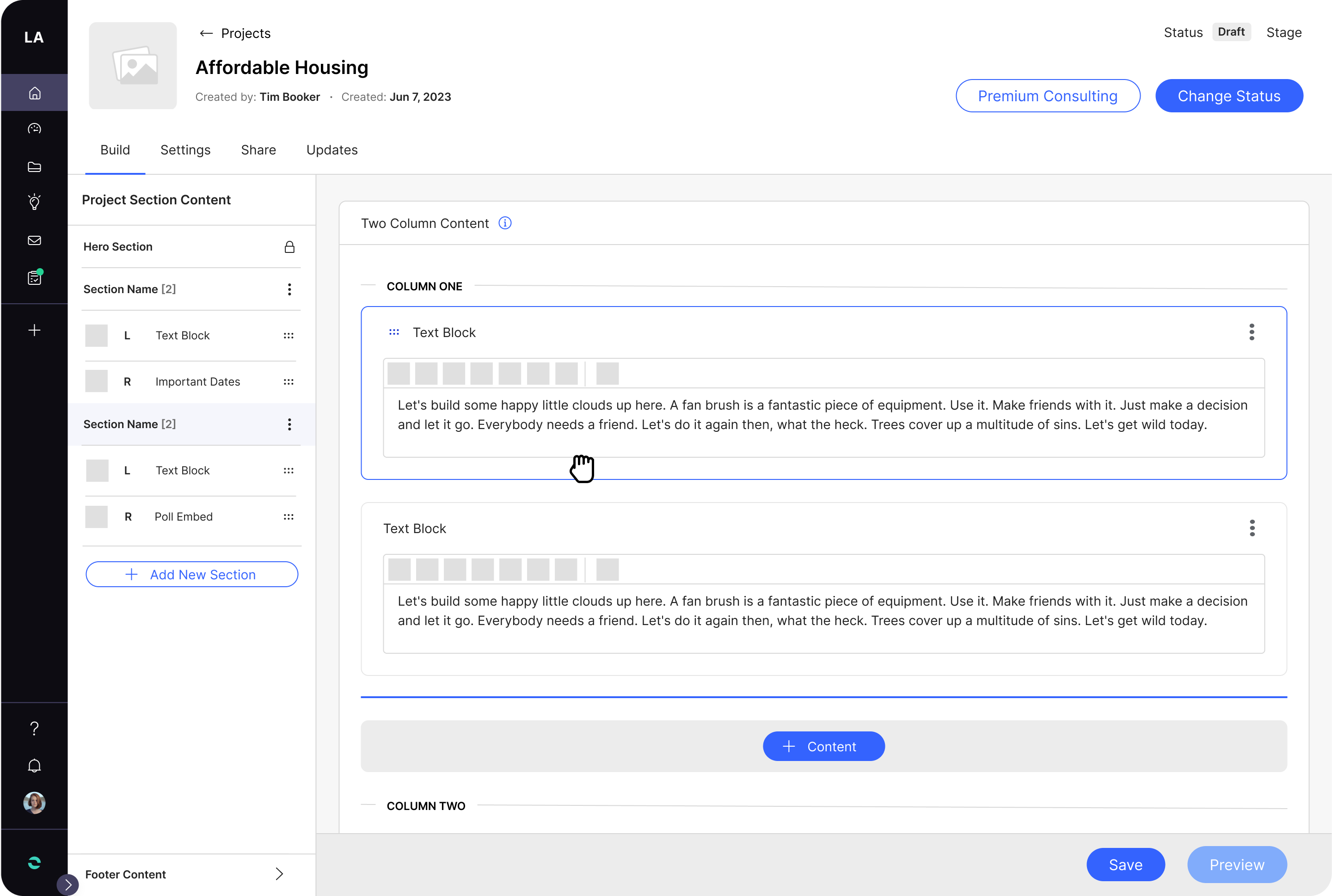
Flexibility
I examined solutions for handling sections with two columns—whether horizontally or vertically. Additionally, I explored various methods for arranging content and sections when shaping a project page
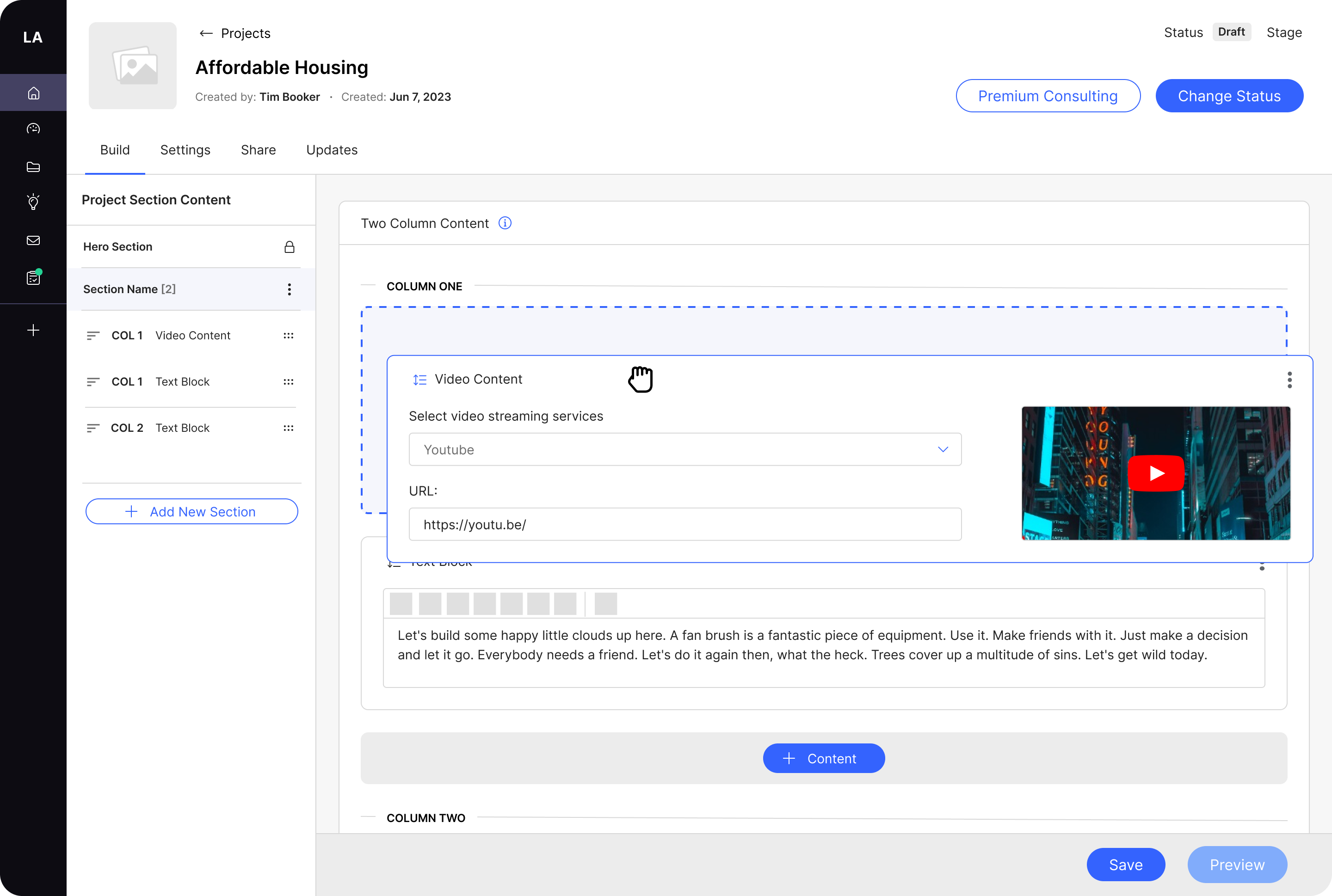
Additional Content Exploration
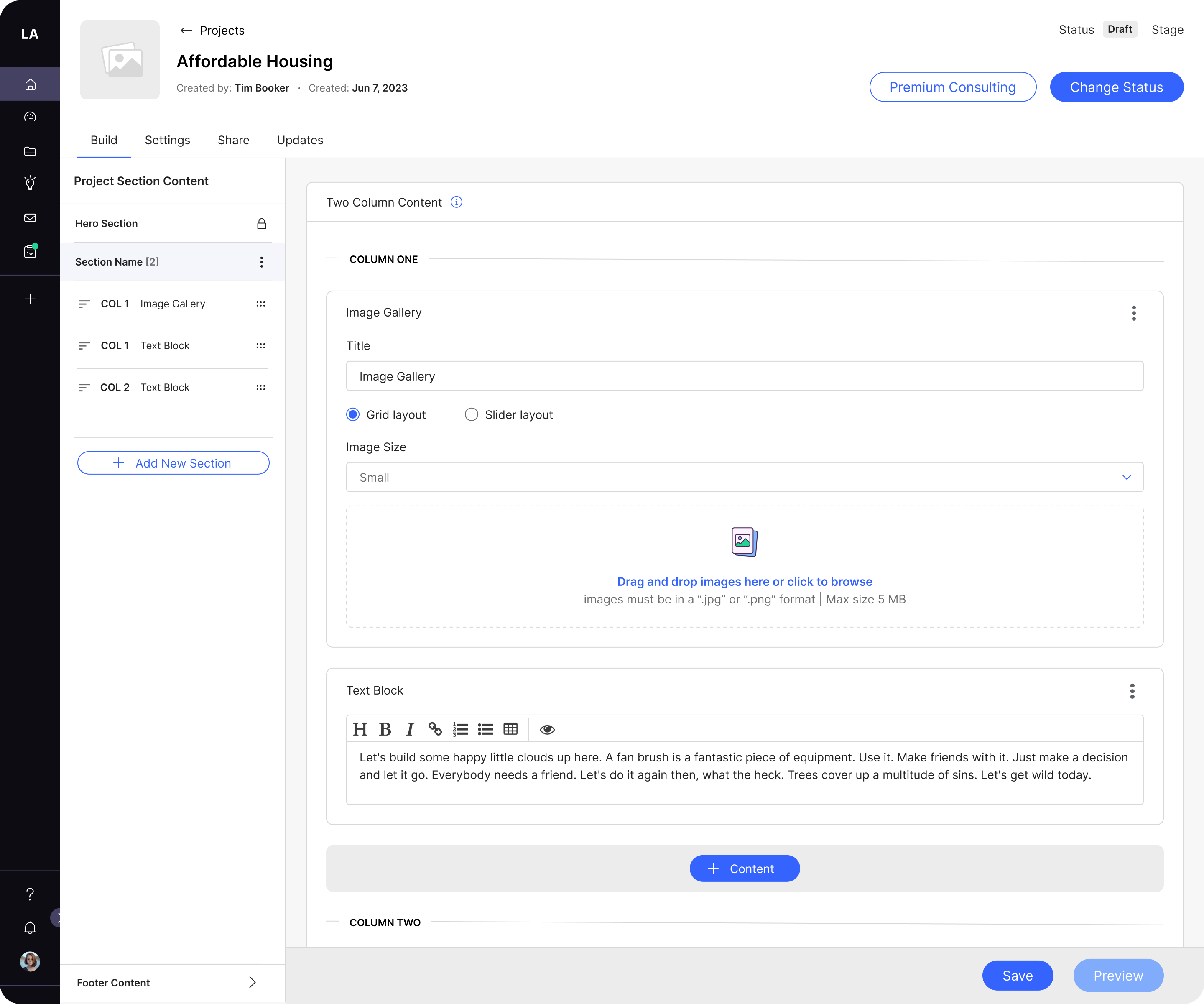
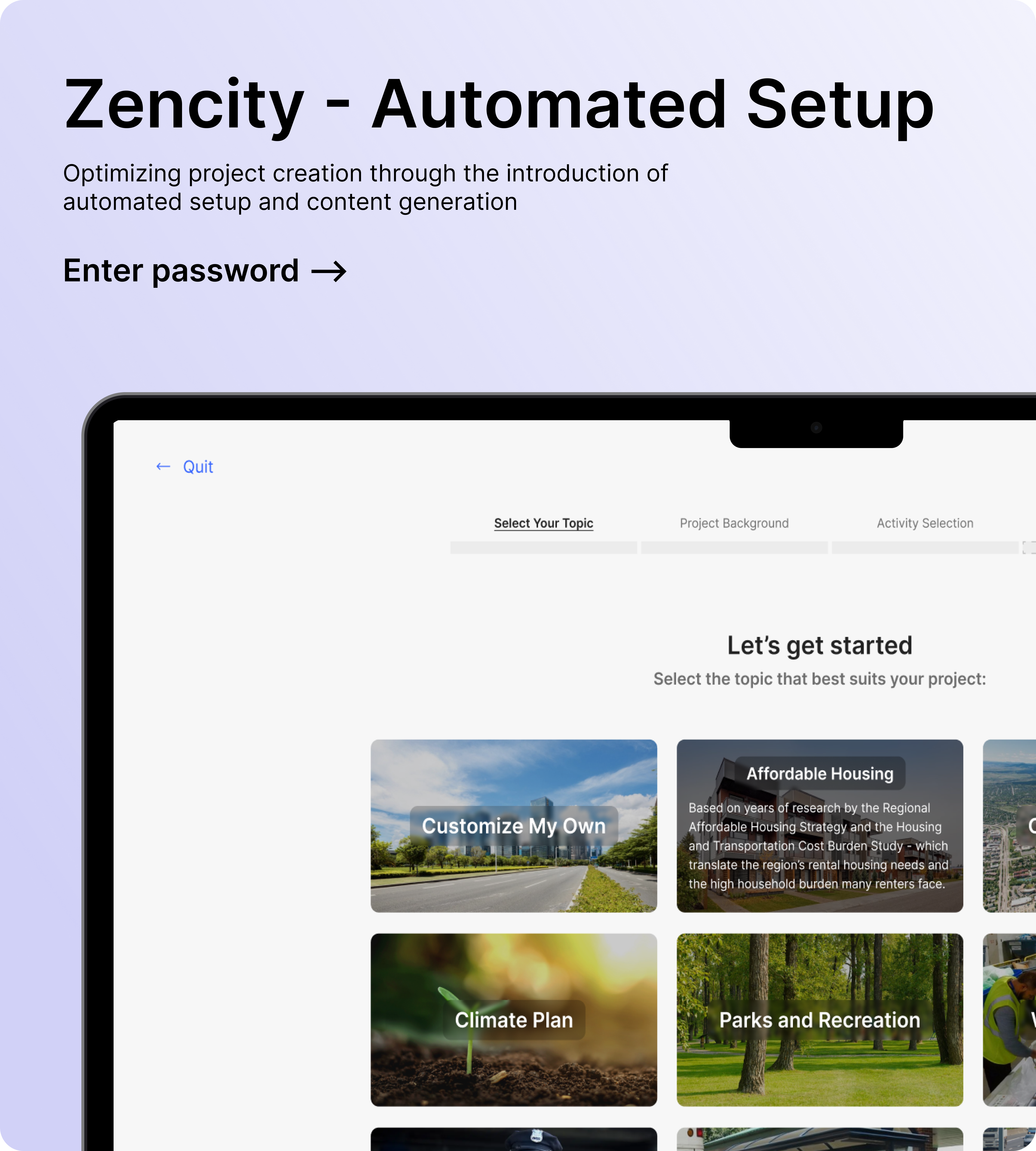
We initially looked to start with Image Gallery where I prioritized the reuse of components to optimize both design and development efficiency.

x
Additionally we need to minimize confusion regarding the 'Change Status' action and the purpose of each status. To address this, I explored methods to elevate the visibility and accessibility of the 'Change Status' action, transitioning it from a dropdown to a button inside the top navigation. Simultaneously, I focused on improving clarity for each status, emphasizing the optimal user journey.
KEY DECISIONS & CONSIDERATIONS
- Consistent Navigation across all builder types (Projects, Engagements, Discussion Topics, Public Boards, and Updates).
- Adding Engagements and other activities to the global navigation.
- Vertical layout for two column content over horizontal.
- Arranging Content, Section or Pages (Engagements) will be handled on the left navigation and content elements will be handled inside the content block.
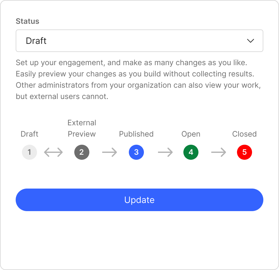
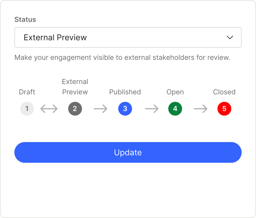
- ‘Change Status’ action moved to the Top Navigation.
Validation & Iteration
With a well-defined design direction, our next goal was to gather targeted feedback on specific design solutions and validate our design decisions.
APPROACH
I conducted six rounds of feedback interviews alongside the Director of Product and the Product Manager
with existing clients.
Method: Feedback interviews via Google Meets (1-2 participants per call)
Time: 25-30 min each.
x
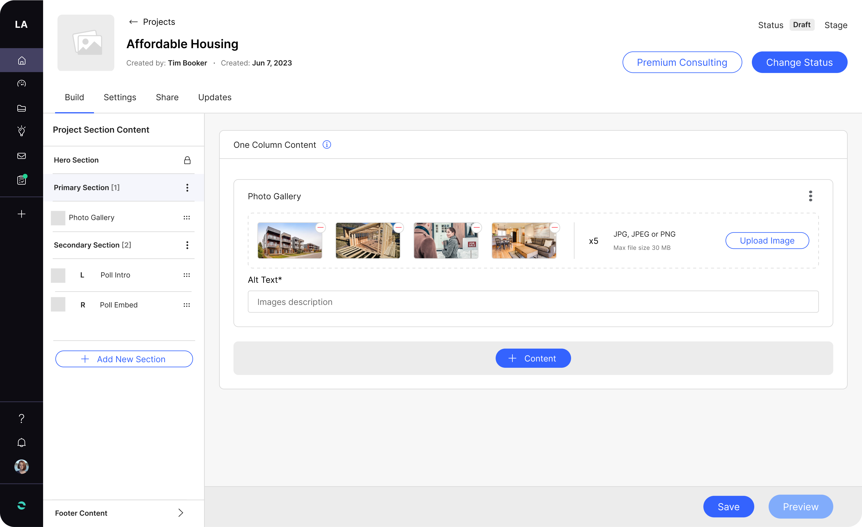
Client Feedback integration: Image Gallery
Addressed the Needs for:
- Ability to Edit the name of specific content.
- Ability to Include captions for images within the image gallery.
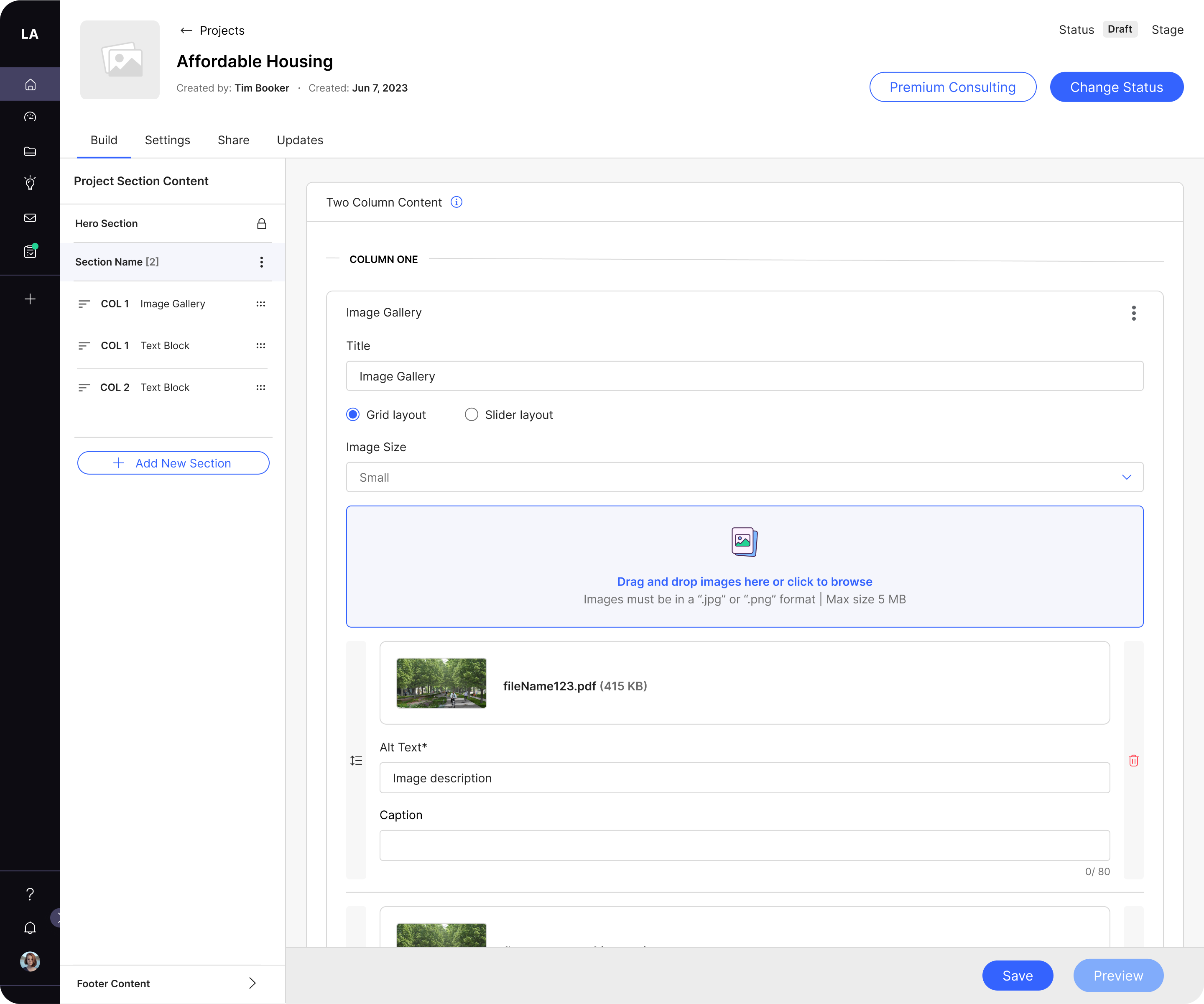
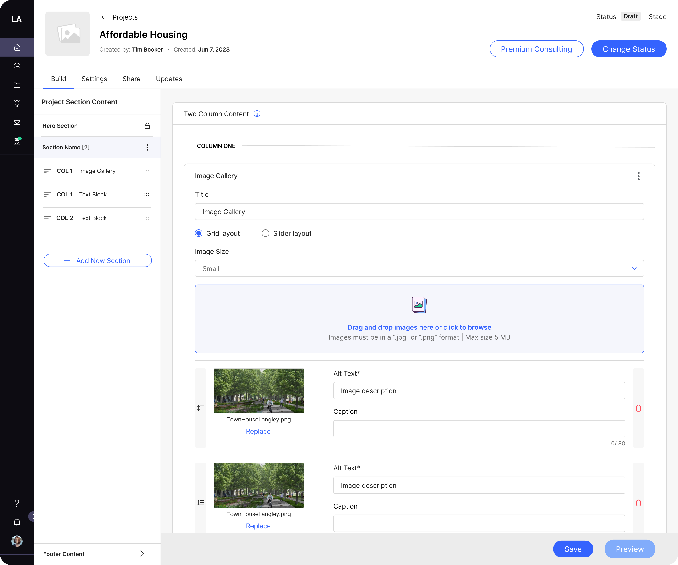
In the iterative process, I introduced a title input field at the top, empowering users with enhanced control in navigating the image gallery. This encompasses the option to add captions under each image, strategically utilizing progressive disclosure to reduce cognitive load by revealing the caption feature only when an image has been added. Acknowledging user preferences, we incorporated the flexibility to adjust image size, presenting a choice between a grid layout and a slider layout. Remaining steadfast in our design principle—never sacrificing simplicity for feature richness—we were cautious about adding complexity unless it truly added value to the user.
Given the two available options, I chose a design that maximizes vertical space while also allowing users to replace an image without the need to delete it first. This enhancement seamlessly aligns with the user's workflow, ensuring a smoother and more intuitive experience.
Discoverability Solutions
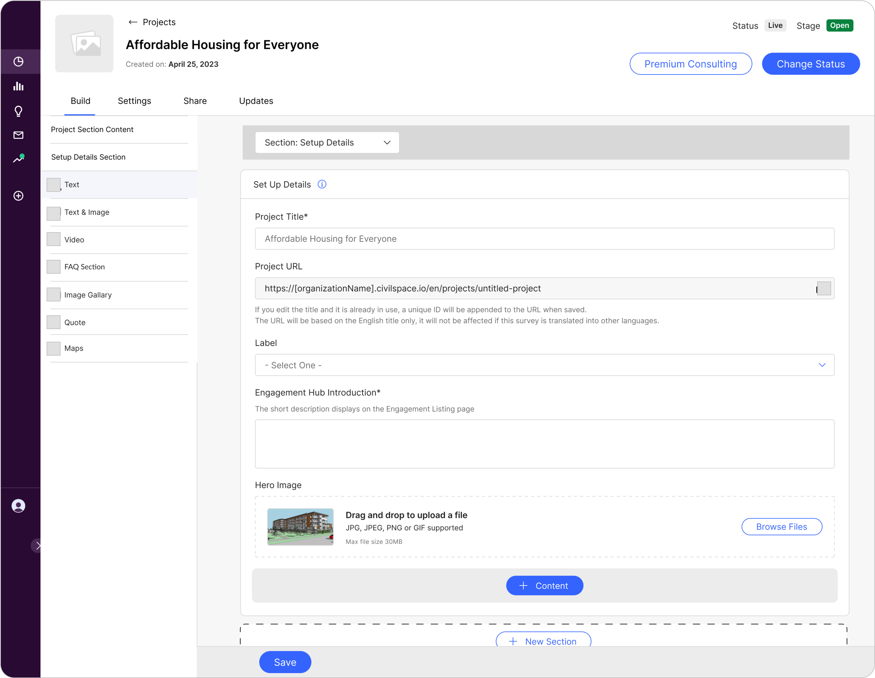
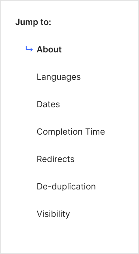
Introduced ‘Jump to Navigation’ for the settings page to help streamline user access to critical sections with a consistent pattern shared with the other builders.
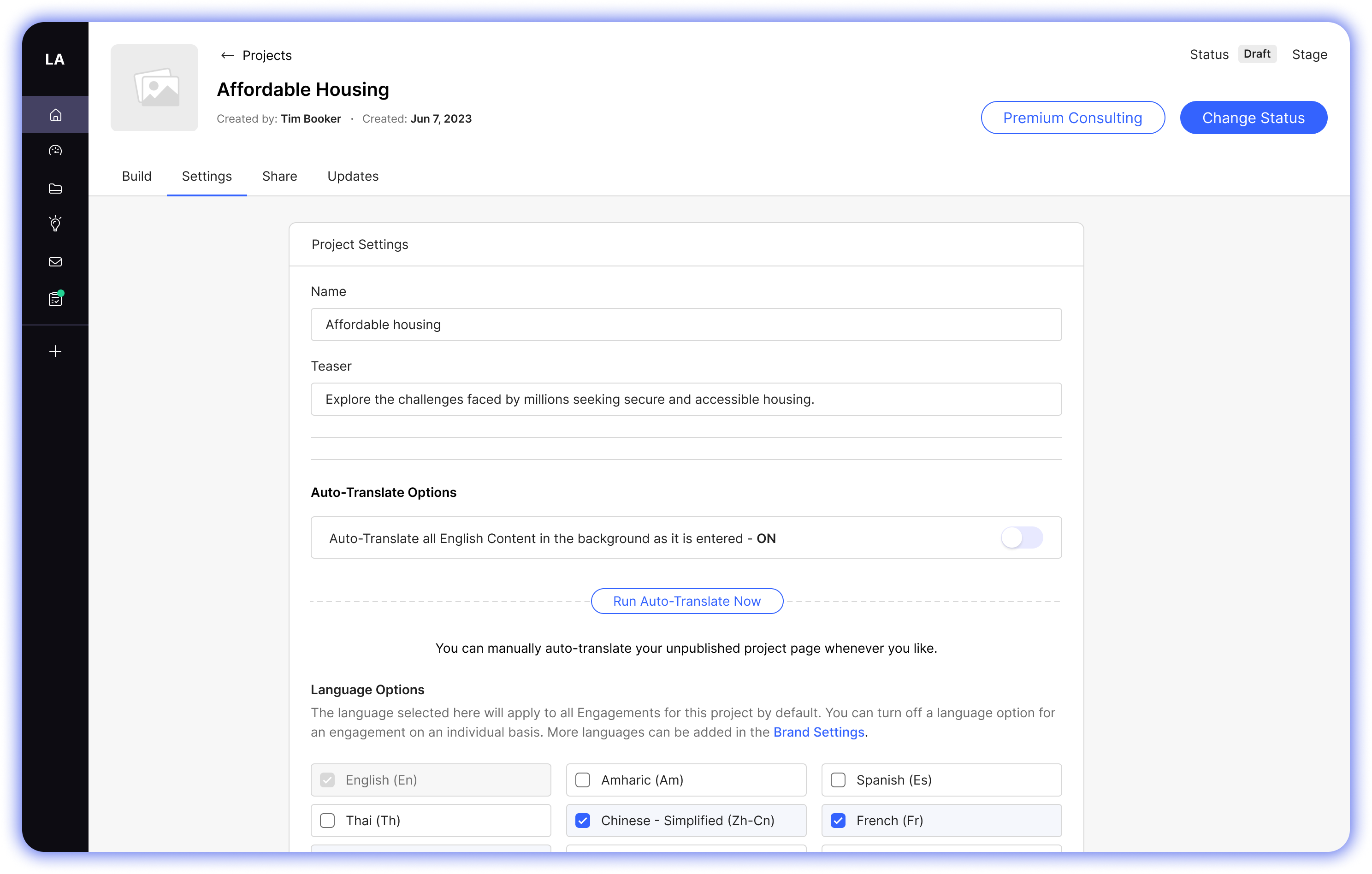
First designs
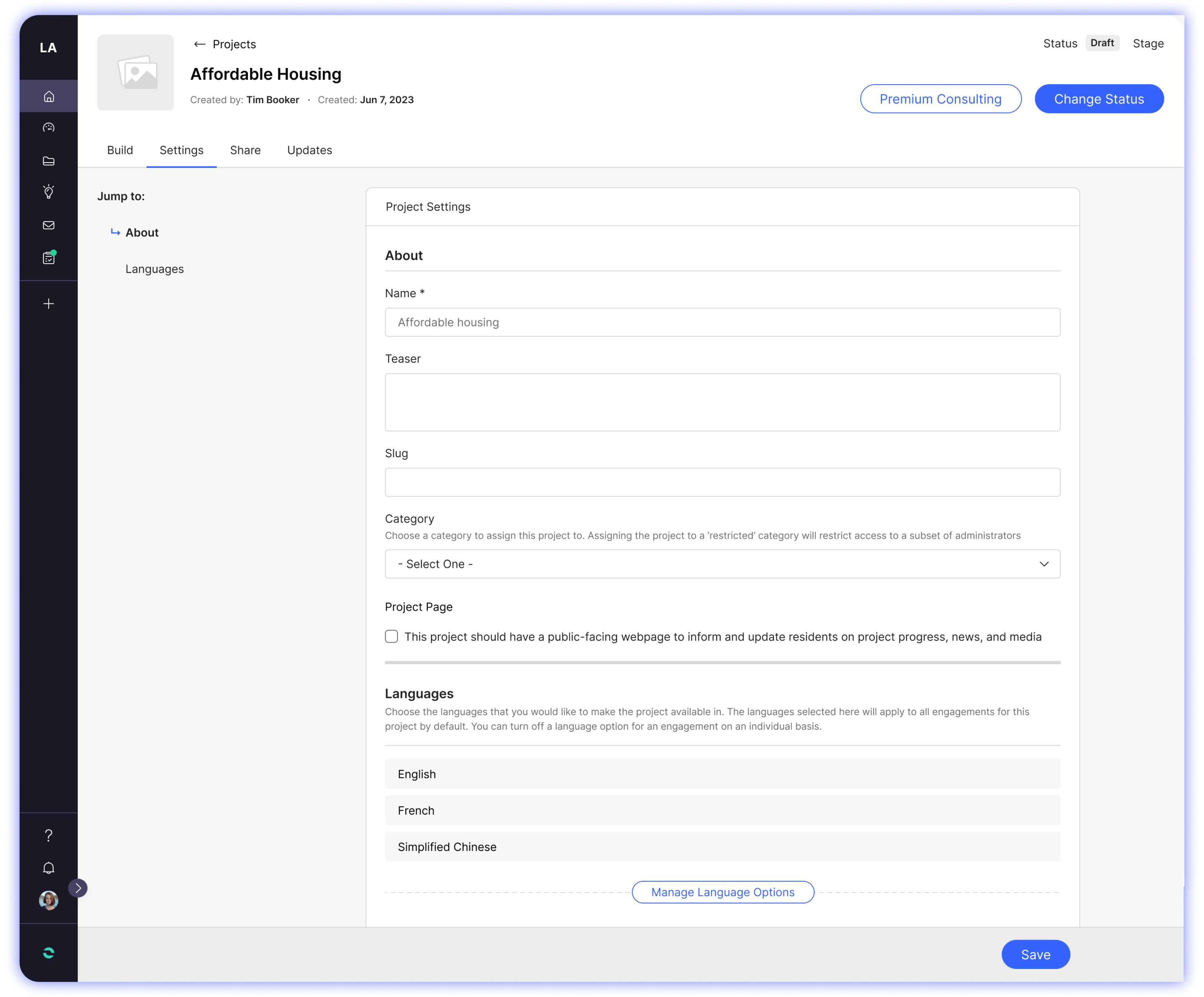
Project Settings with Jump to Navigation
Engagements
Visual Hierarchy and Clarity (Top Navigation)
- Added hyperlinks for quicker and intuitive navigation.
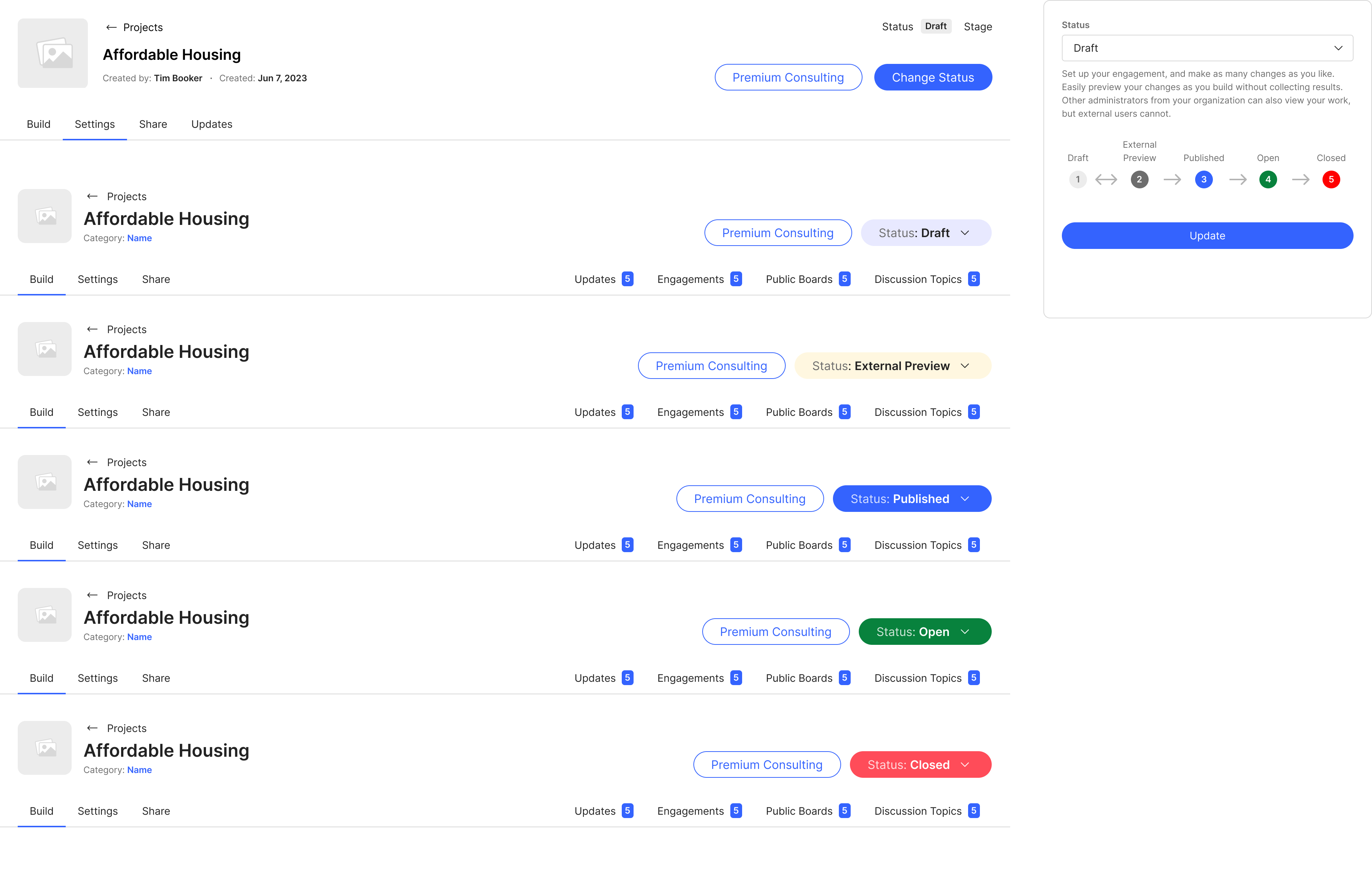
- Changed the 'Change Status' action from a button to a split button with the current project status displayed on the surface level (Status: Draft)—instead of a tag with the current status above the button— This aims to enhance affordance and improve visibility by providing a clearer signal for user interaction and ensures immediate visibility of the current project status, contributing to a more intuitive and user-friendly experience.
I also presented an opportunity to introduce color-coded states to the 'Change Status' action, representing the project's current status (Draft, Published, Opened, and Closed). These visual cues serve to enhance discoverability, enabling users to effortlessly locate and comprehend the project's status at a glance. This initiative aimed to make the user flow for project status more intuitive and user-friendly, ultimately reducing cognitive load and providing a quicker way for users to grasp vital information.
Digitization
After finalizing the selected designs and initiating discussions with our development team early to explore feasibility, I provided feature spec documentation to guide the upcoming implementation process. Any feedback or necessary changes were meticulously documented and shared with the
Impact
As the project is still in development, the full impact is yet to be realized. However, we have already achieved a 50% reduction in clicks for creating new activities, enhancing navigation clarity, and improving overall discoverability.
Selected Works
Diablo ImmortalsEvaluating the current player experience
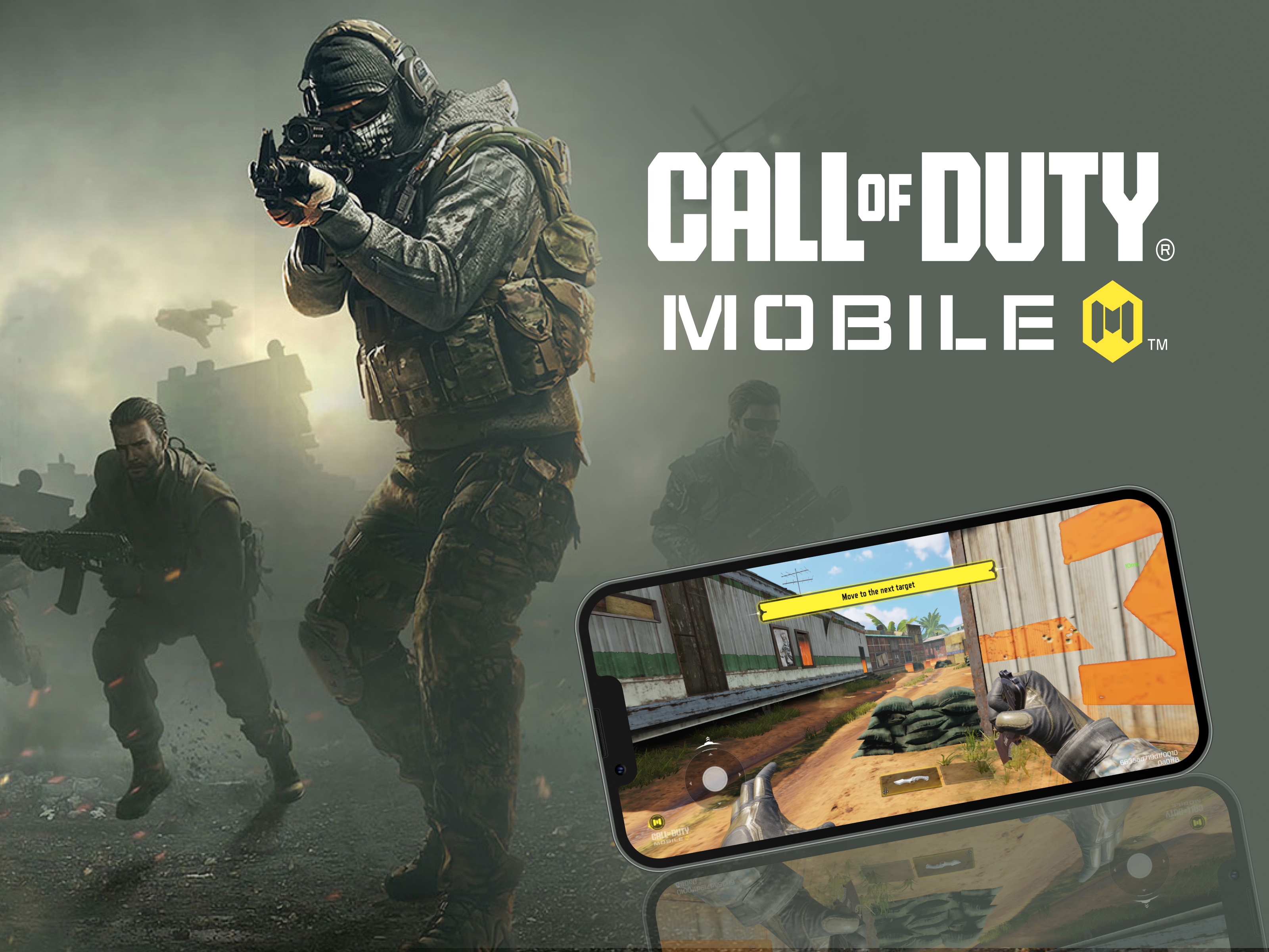
Call of Duty - MobileD1 Retention Analysis
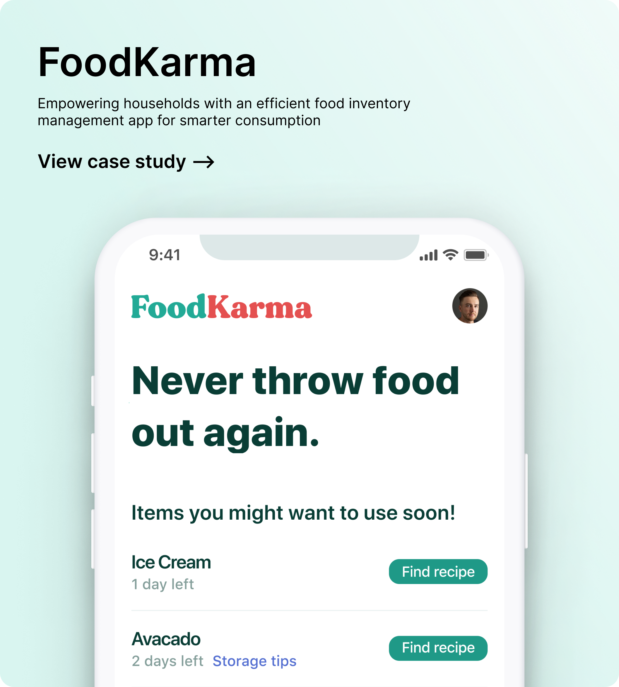
FoodKarmaFood waste management app
(OLD) Zencity - EngageRedesigning the whole project building experience
Zencity - EngageAutomated setup for Engagements
Zencity - Engage: BuildersRedesigning the whole project building experience