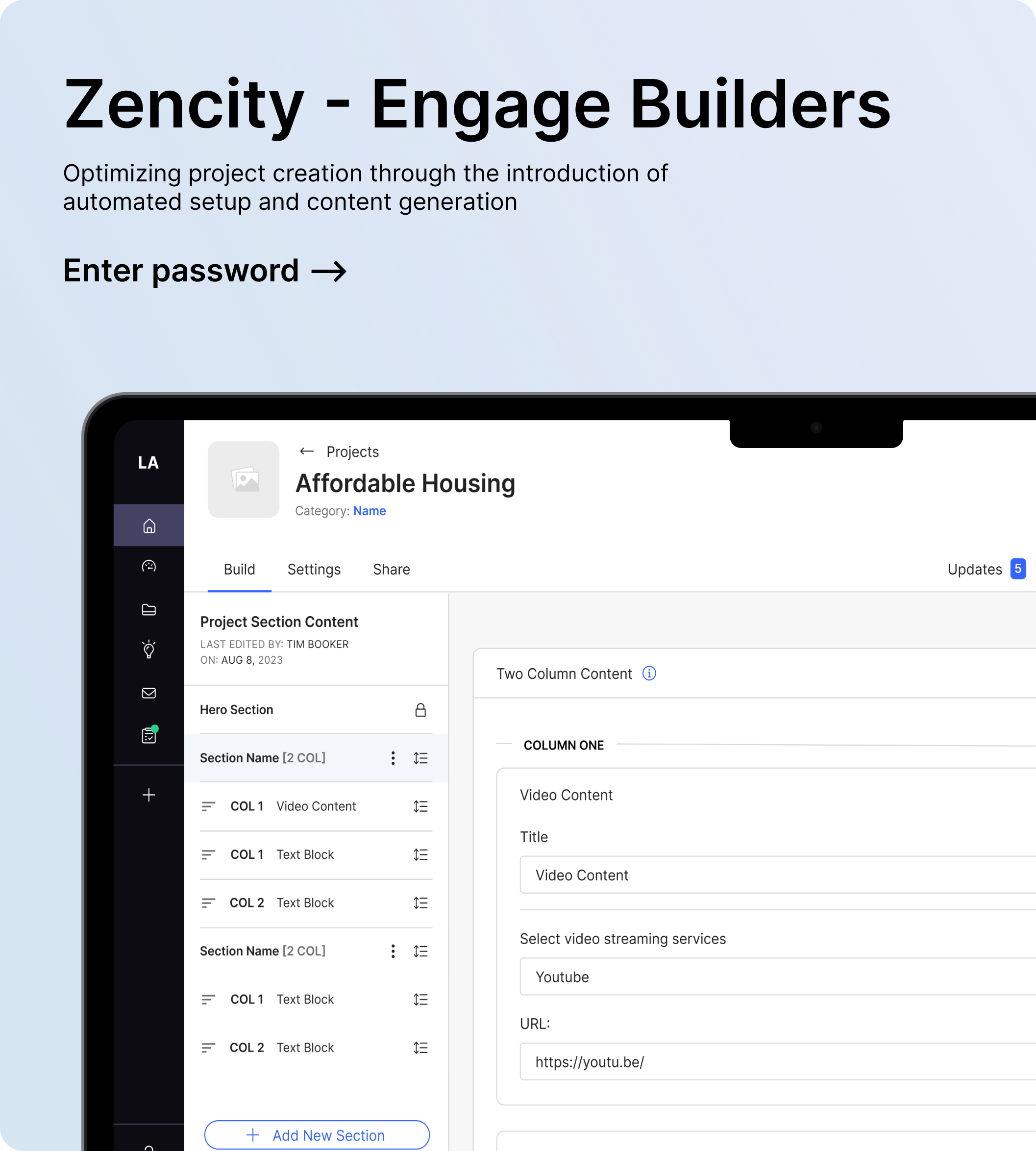
Zencity - Engage
Redesigning The Project Building Experience
Overview
Zencity is a data analytics company that focuses on assisting local governments in gathering insights from residents to make informed decisions. Engage is a tool on the platform that enables local governments and municipalities to create resident-facing project pages and other activities to gather resident feedback, such as engagements, discussion topics, and public boards.
Challenges
- Engage has experienced a decline in adoption since joining Zencity.
- Clients have expressed feeling overwhelmed when creating their first project page.
- Clients have expressed a need for diverse content types and additional flexibility.
- Lack of discoverability around some of the less used activities on Engage (Engagements, Discussion Topics, and Public Boards).
Business Goals
- Increase adoption and discoverability for Engage and some of its less-used features on the Zencity platform.
- Improve the onboarding experience and value for building a resident-facing project page.
ROLE
Lead Product Designer (Engage Team)
Duration: 6 months
Status: In-Development
Legacy - Project Builder

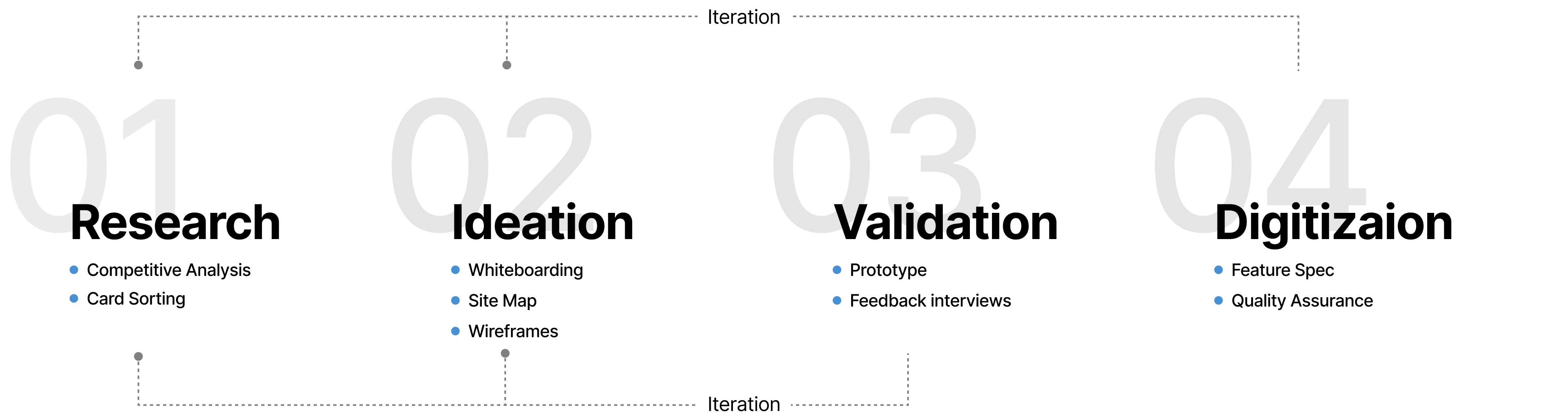


Competitive Analysis
I initiated research by exploring the design approaches used by other products and services related to creating a project page or engagement. Before delving into opportunities identified through competitive analysis, it's crucial to note that our goal was not to create a website builder but rather to prioritize simplicity and meet the needs of building a resident-facing project page.
Distinct Tab and Consistency for All Builders
In our legacy design, all elements, including title, content, settings, and options, were consolidated on a single page.
Navigation for Content & Sections
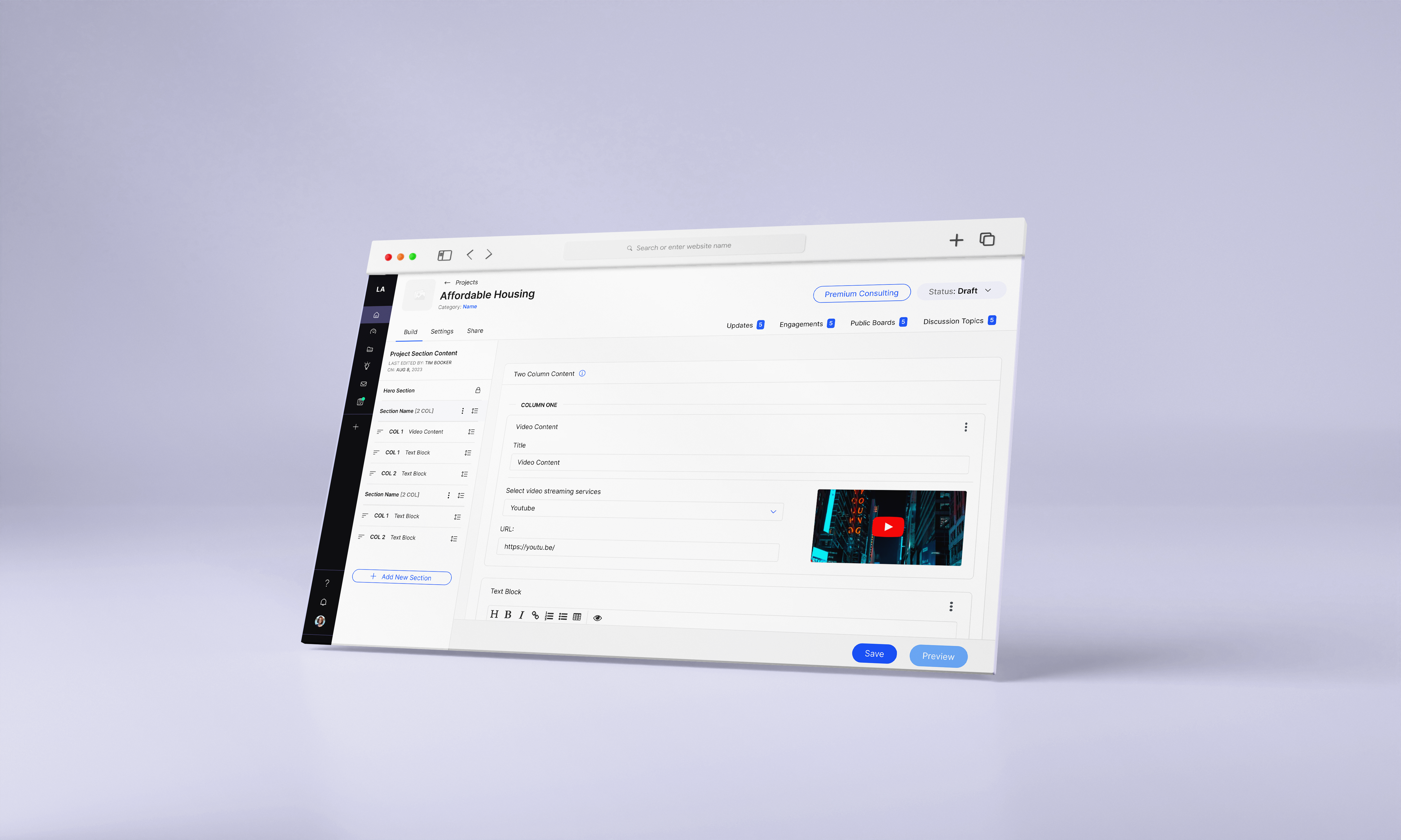
In the current state, our builders lacked a quick and intuitive way for users to navigate between different sections or content on the page. The Engagement builder is unique as the only one with side navigation and utilizing pages instead of sections. Recognizing the need for a consistent navigation system for all the builders.
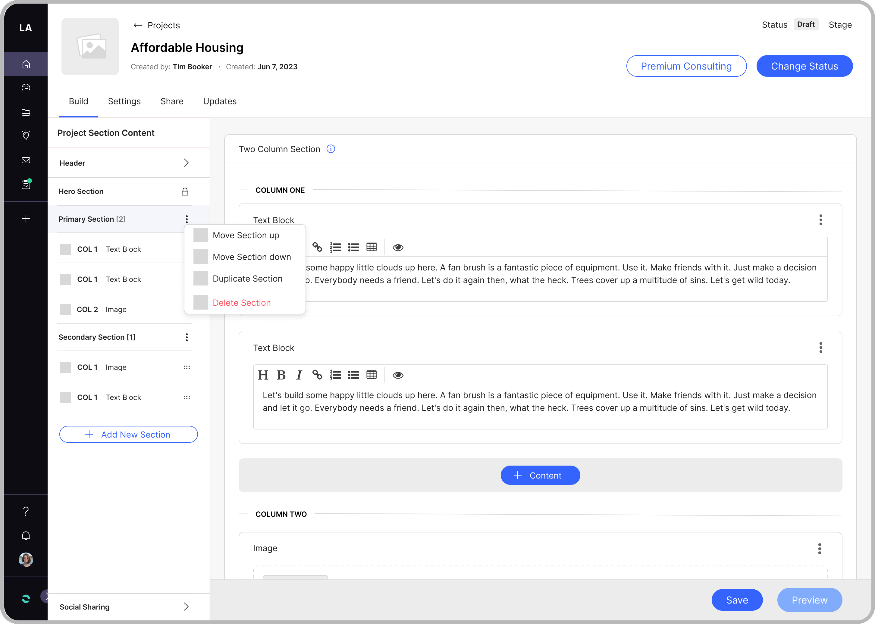
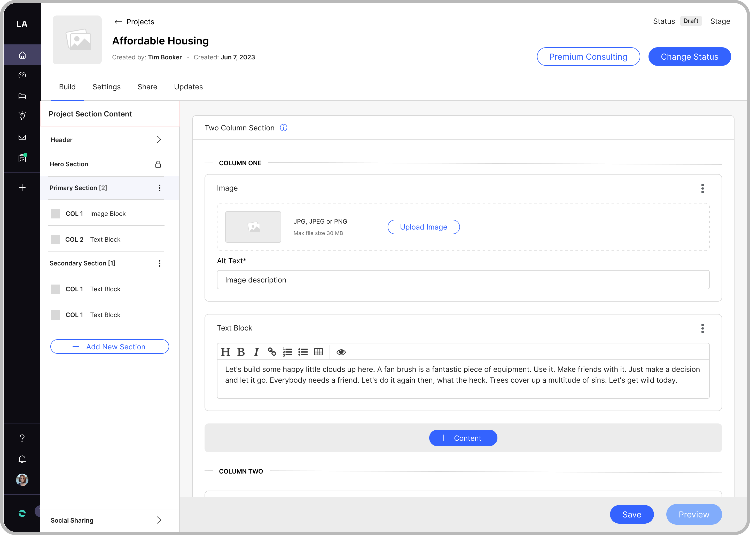
Greater Flexibility
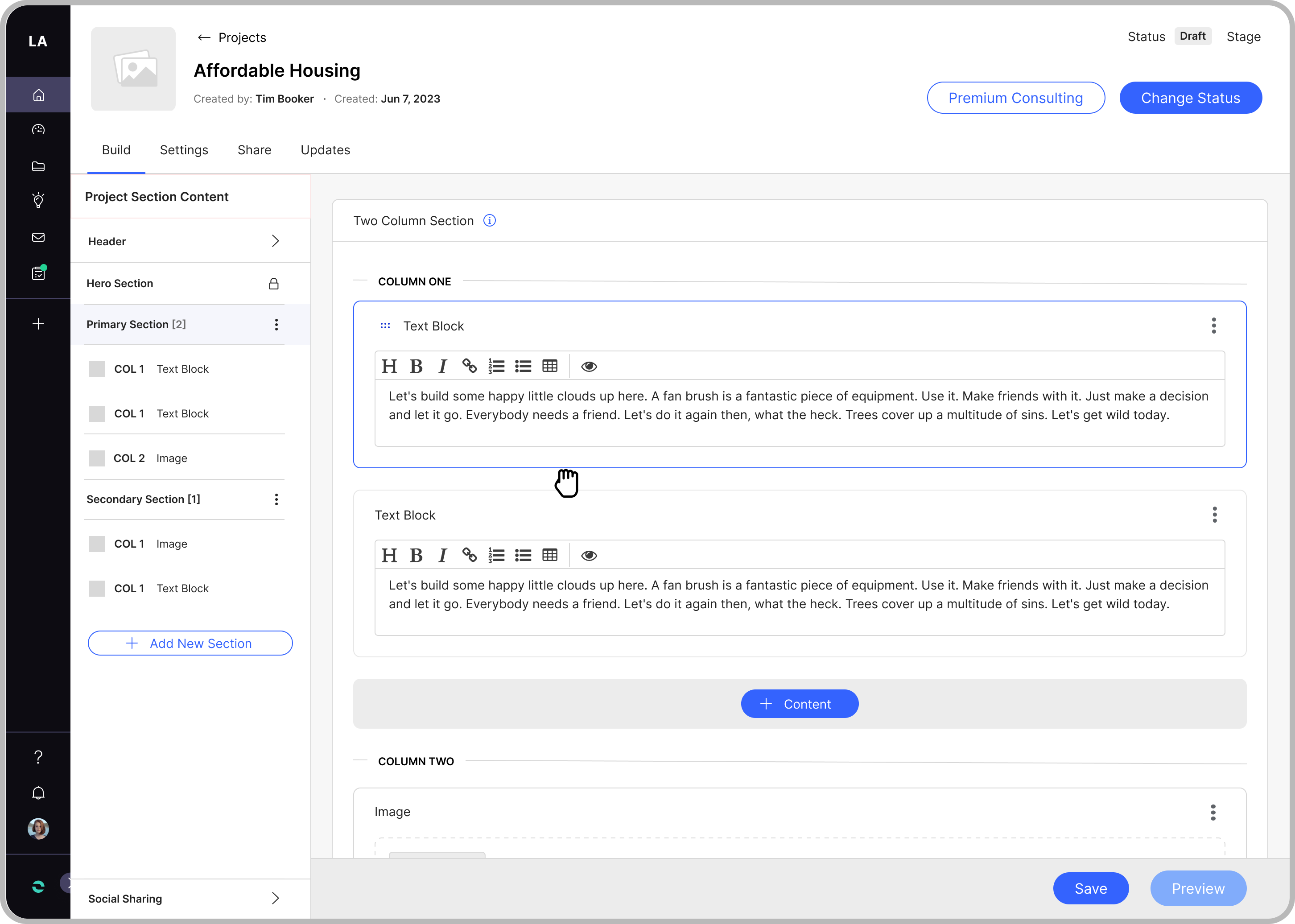
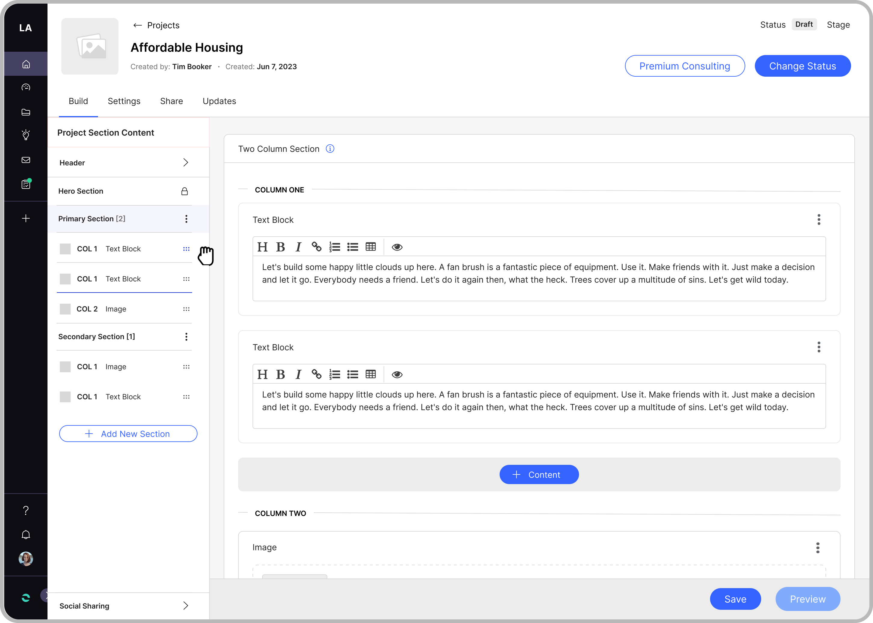
Currently, the builders lack flexibility, restricting content to a single column without the ability to arrange sections, content, or pages. Introducing options for two-column content and enabling arrangements could provide greater flexibility and control.
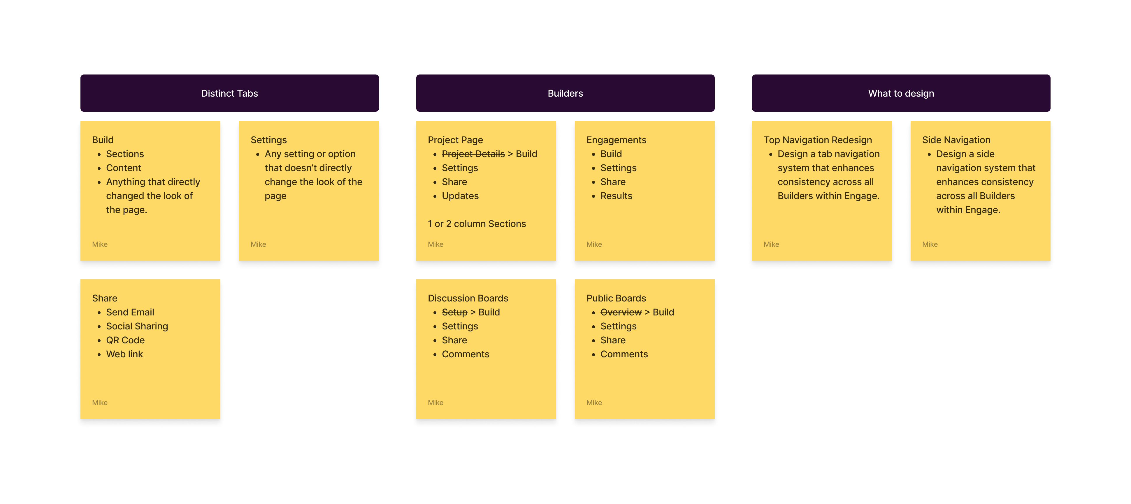
Card Sorting Exercise
I created a FigJam board to share an early concept of the potential layout and deliverables.

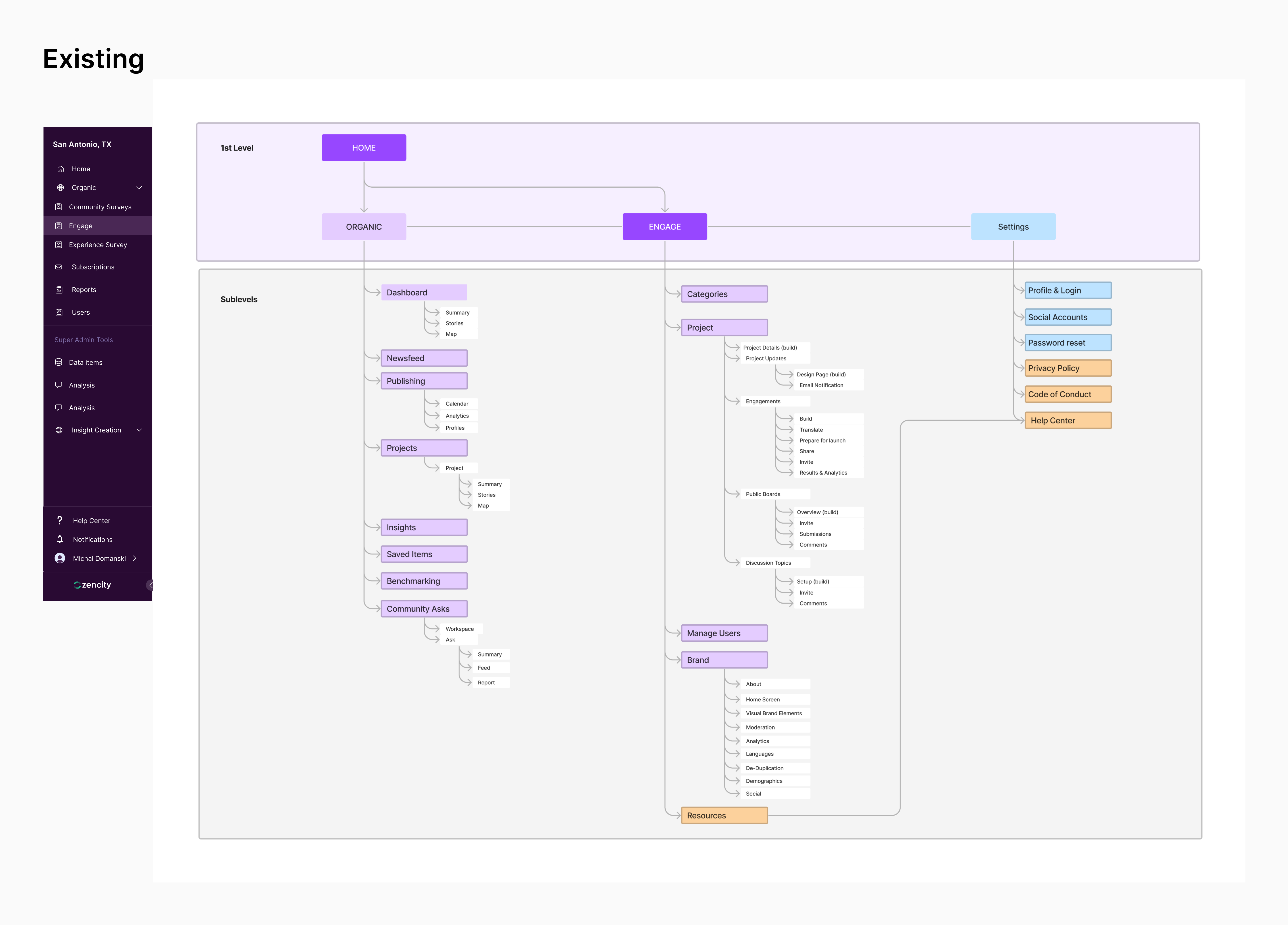
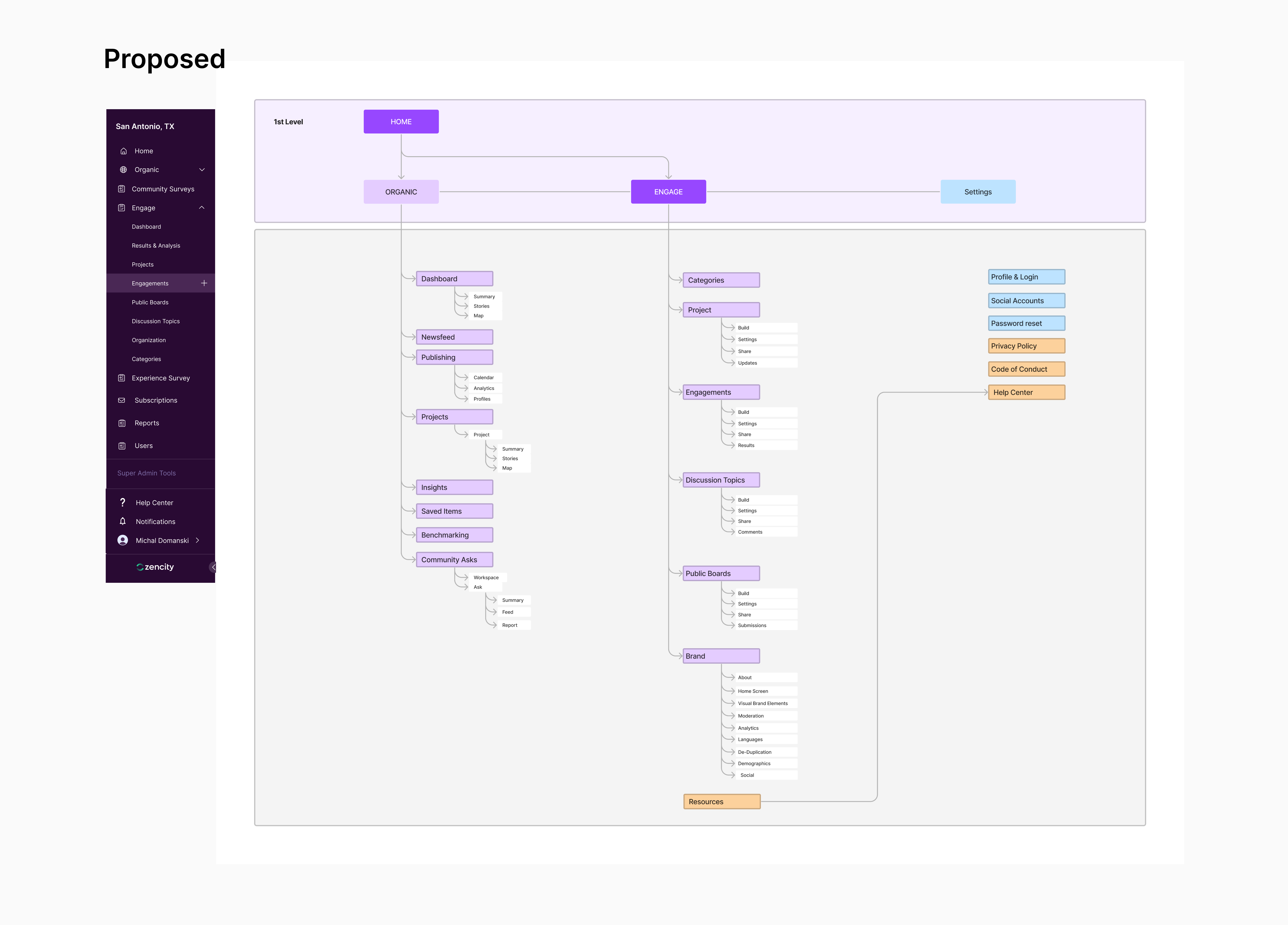
Site Map
Before diving further into the design process, I engaged in close collaboration with the Director of Product and Product Manager to develop a site map. Given our key objective of enhancing adoption and discoverability, this collaborative effort sparked valuable discussions and enabled us to pinpoint opportunities for refining global navigation. By strategically integrating additional activities such as Engagements, Discussion Topics, and Public Boards into the global navigation, we aimed to improve discoverability for less-utilized features, ultimately enriching the user experience.
Working in Medium/High Fidelity
Normally, I like to sketch before going digital. However, leading the migration of the Engage Rails design system to Zencity, I reused many existing components and helped craft new ones to address specific Engage needs. I felt comfortable jumping into medium-high fidelity, as it would also help us test micro-interactions better with our clients during feedback or prototype reviews.
Navigation & Consistency
For the project builder, I explored various options. These included presenting all content and sections on a single scrolling page or utilizing in-page navigation and side navigation. This consideration became particularly important when thinking about engagements that use pages instead of sections.

Flexibility
I examined solutions for handling sections with two columns—whether horizontally or vertically. Additionally, I explored various methods for arranging content and sections when shaping a project page
Additonal Content
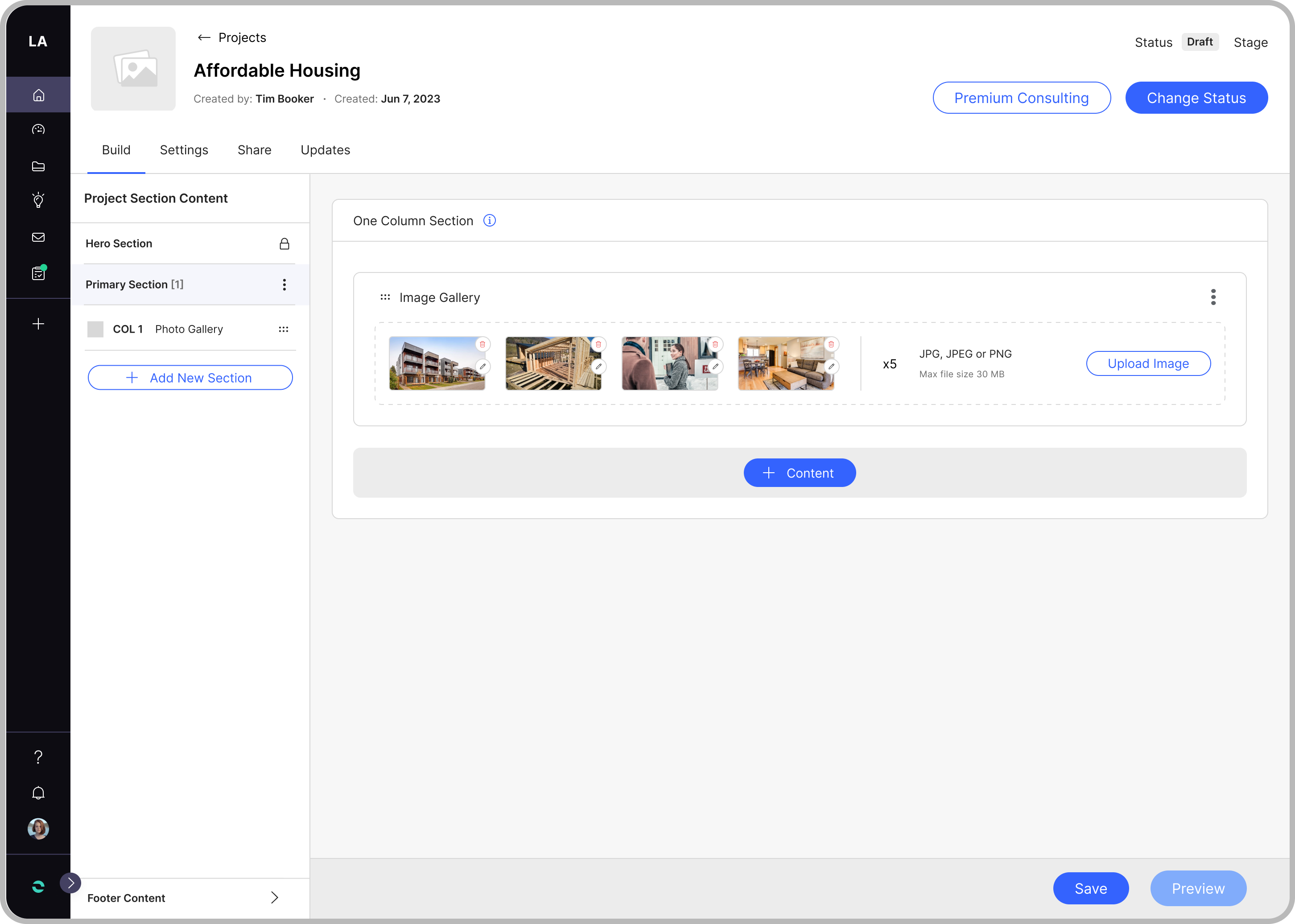
We initially looked to start with Image Gallery where I prioritized the reuse of components to optimize both design and development efficiency.
Key Decisions & Considerations
- Consistent Navigation across all builder types
- Engagements and Other Activities to The Global Navigation.
- Side Navigation for Sections and Pages.
- Vertical layout for two-column content over horizontal.
- Arrange Content & Sections - Side Navigation Only.
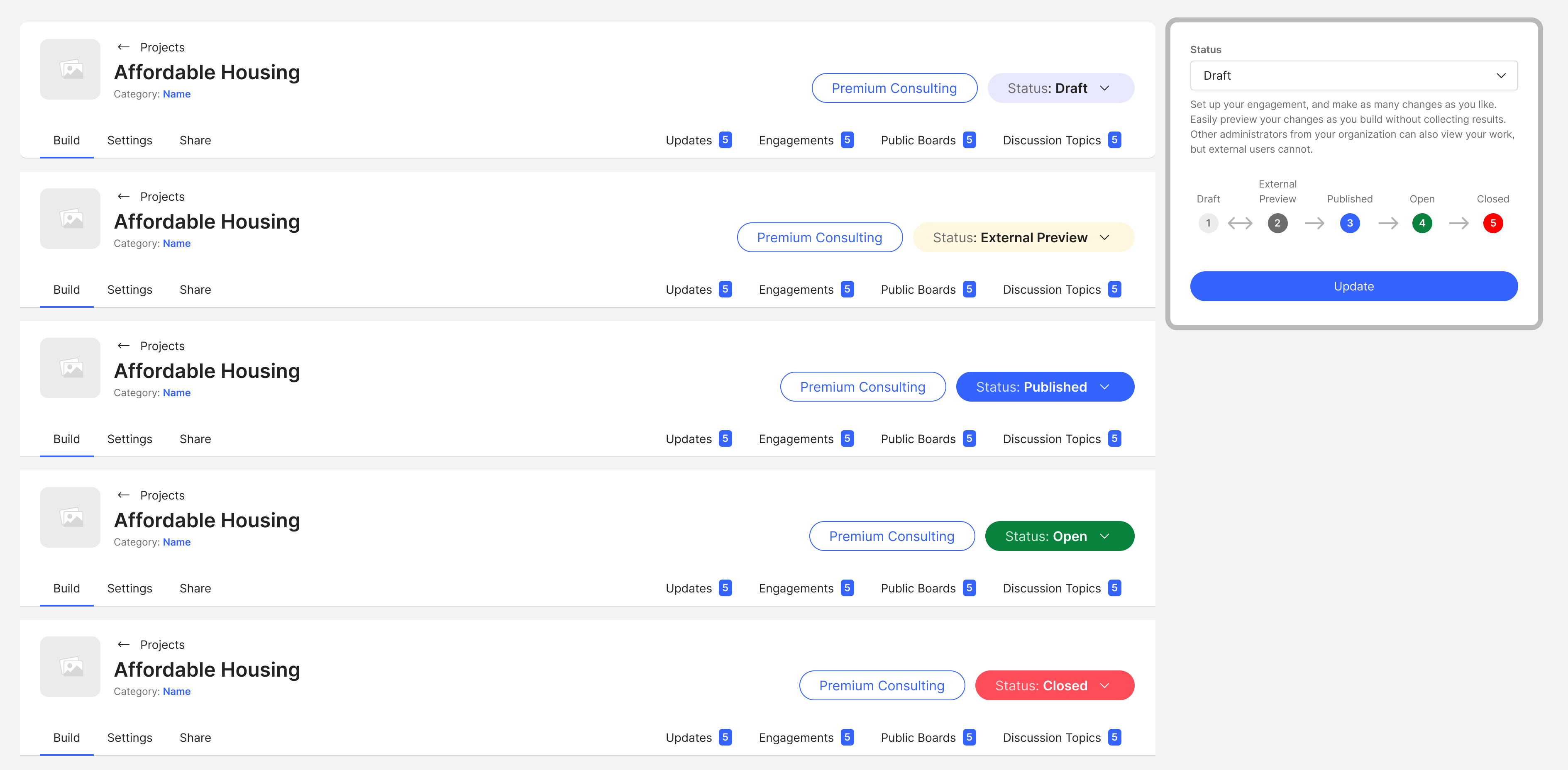
- The 'Change Status' action has been moved to the top navigation.

Client Feedback Interviews
With a well-defined design direction, our next objective was to gather feedback on specific design solutions to ensure alignment with user needs and expectations, validate our design decisions, and make necessary refinements.
I conducted six rounds of feedback interviews with existing clients alongside the Director of Product and the Product Manager.
Method: Feedback interviews via Google Meets (1-2 Participants per call)
Time: 25-30 mins per call
What Worked
- Clients loved the increased flexibility in arranging content and sections, as well as the option to choose between a 1-column or 2-column page layout.
- Clients found the new structure of the project page builder to be more intuitive and significantly easier to navigate.
What's Missing
- Some clients expressed a need to edit the names of specific content items added to the project page.
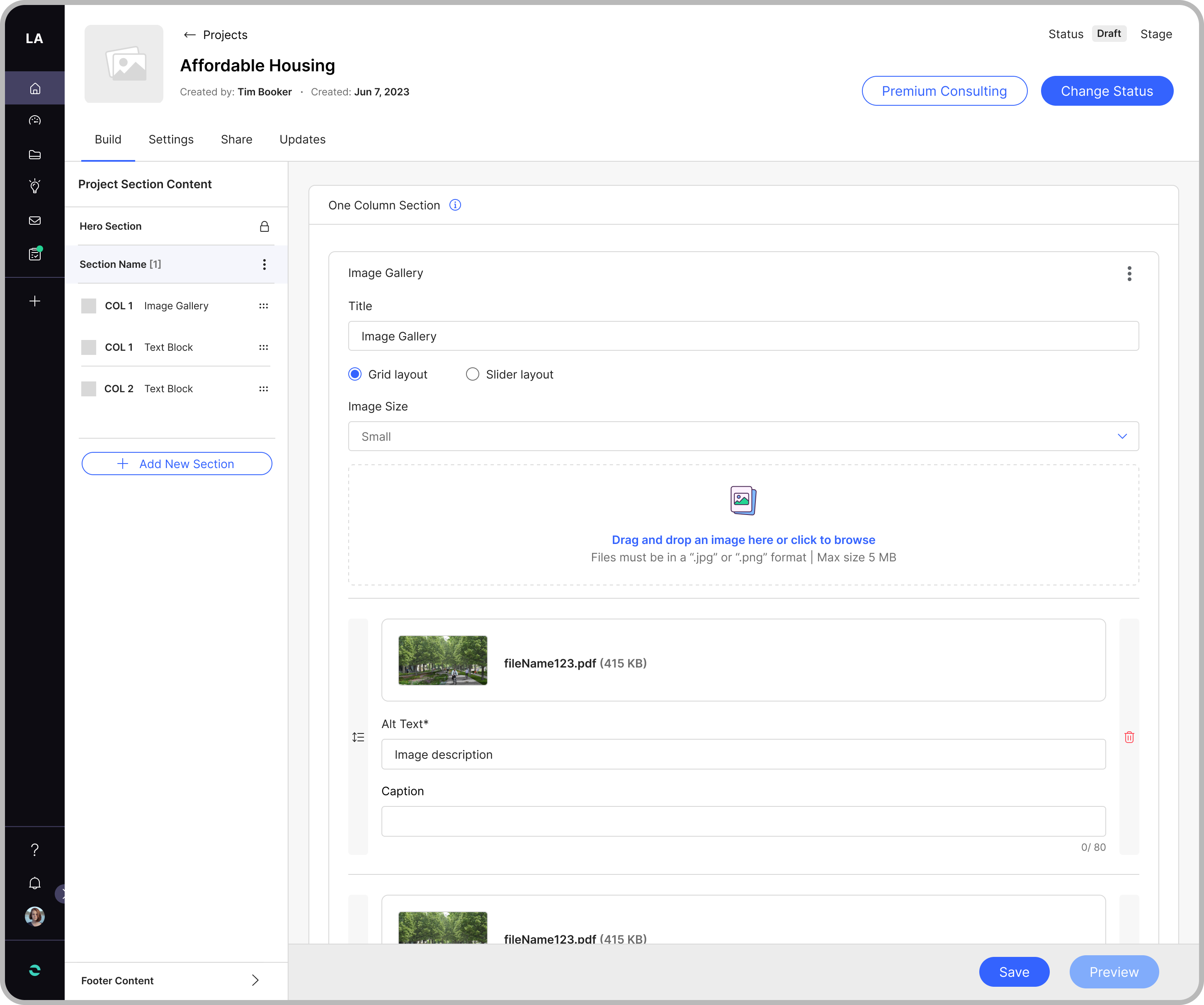
- When discussing the Image Gallery, a few clients requested the ability to add captions to individual images. They also highlighted issues regarding image size control when building out the project page.
What We Did
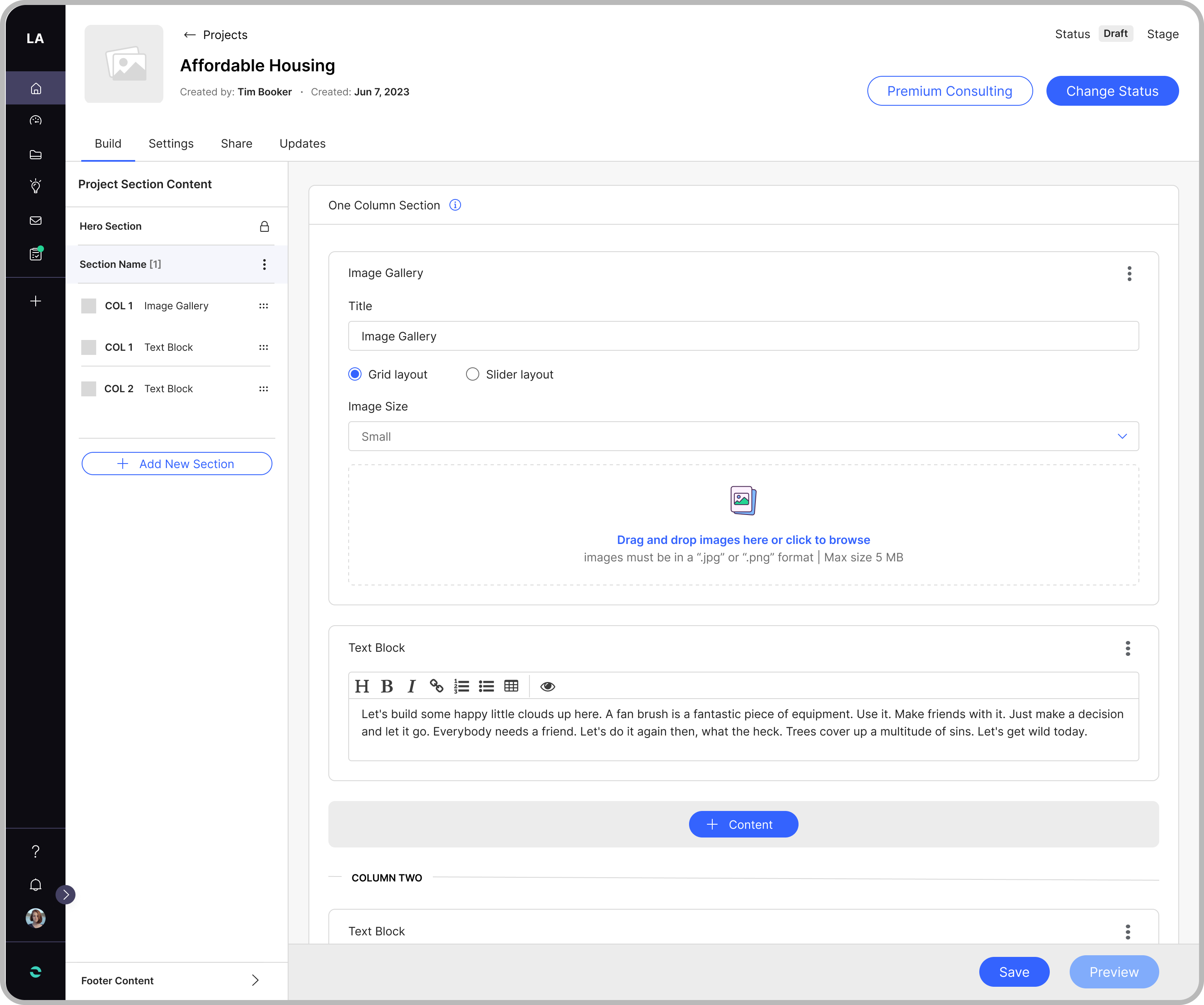
- Added a title input field for specific content types.
- Included captions under each image for the image gallery.
- Employed progressive disclosure to make captions visible only when an image is added.
- Added flexibility to adjust image size (Small, Medium, Large).
- Provided options for grid or slider layouts in the Image Gallery.
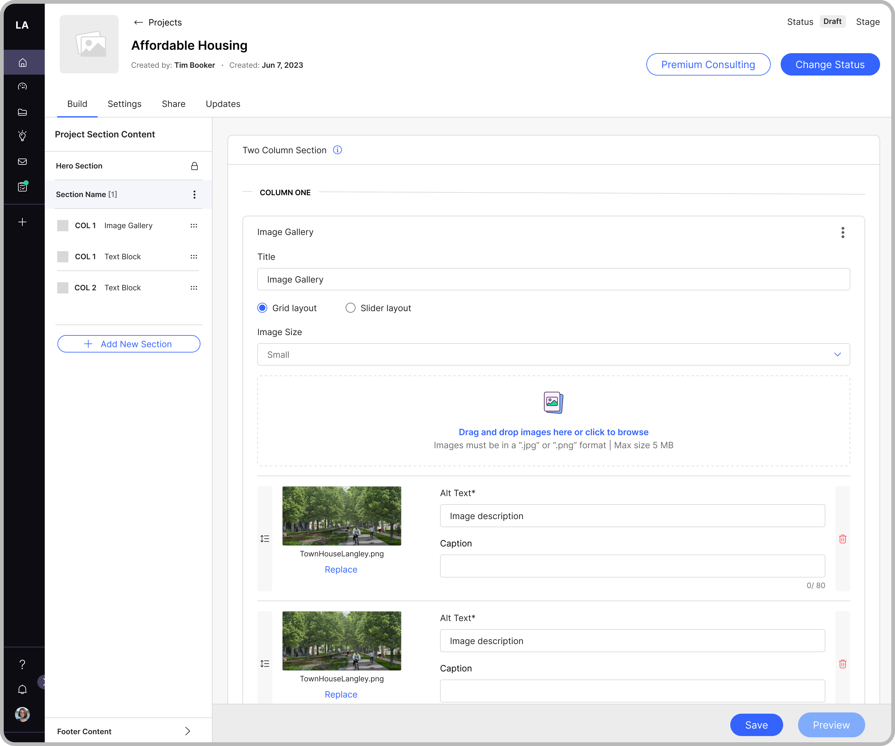
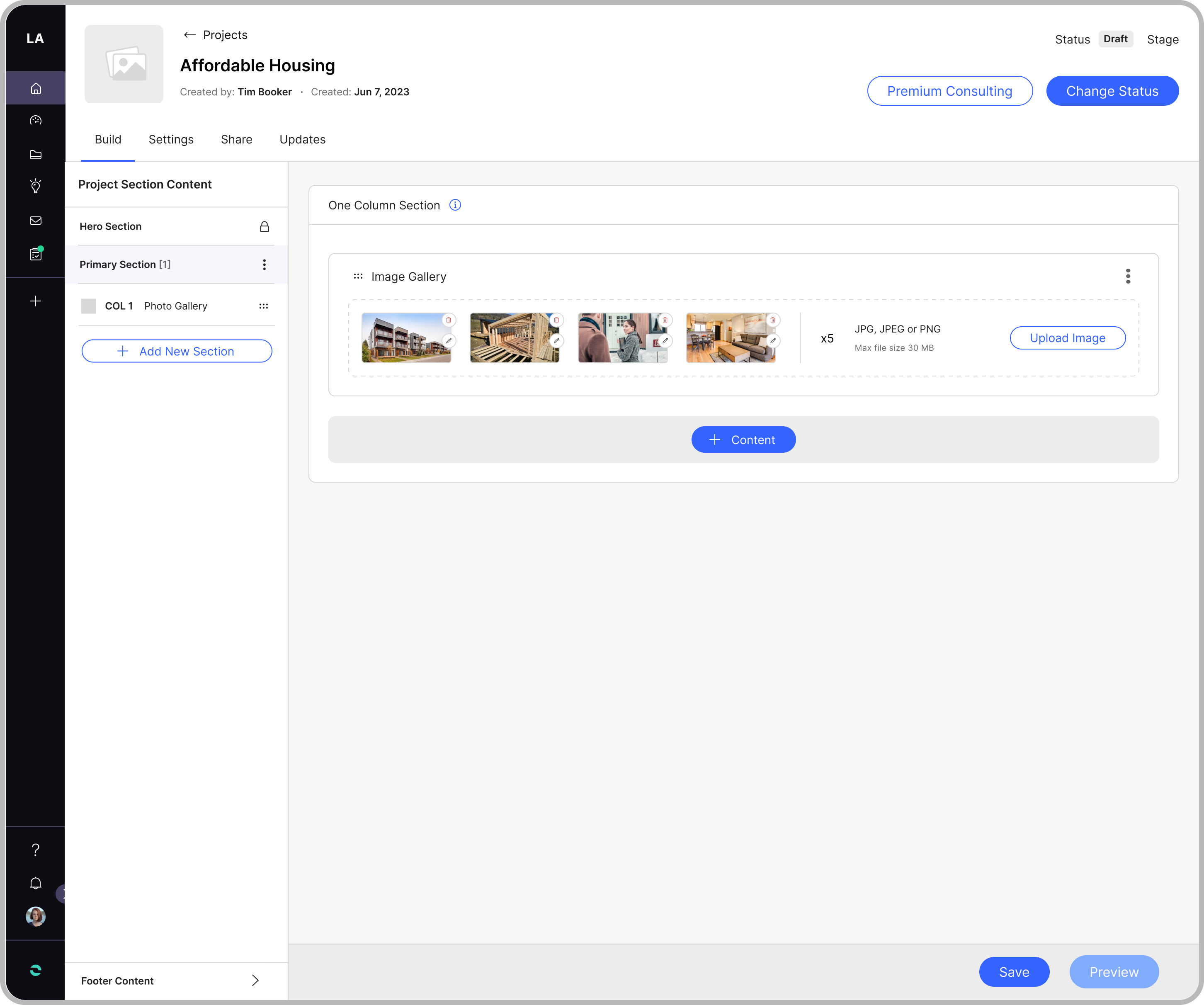
Given the two available options, we chose a design that maximizes vertical space while also allowing users to replace an image without the need to delete it first.


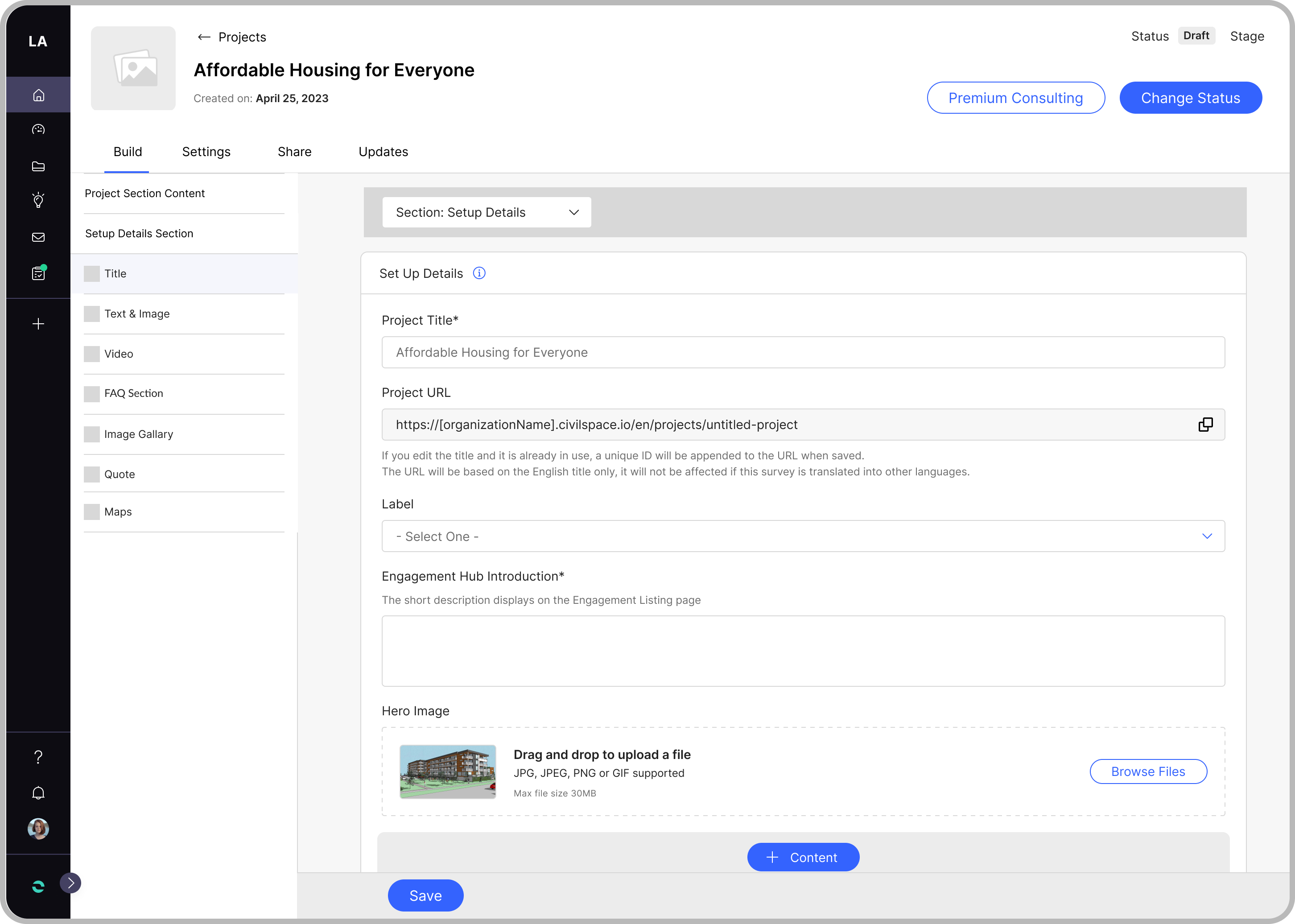
Project Builder Navigation
- Consistent Navigation across all builders.
Top Navigation (Project Page Builder)
- Hyperlinks to enhance navigation speed
- Color-coded states to the 'Change Status' action to increase clarity.
- Child activities like Updates, Engagements, etc., are added to the top navigation for enhanced accessibility.
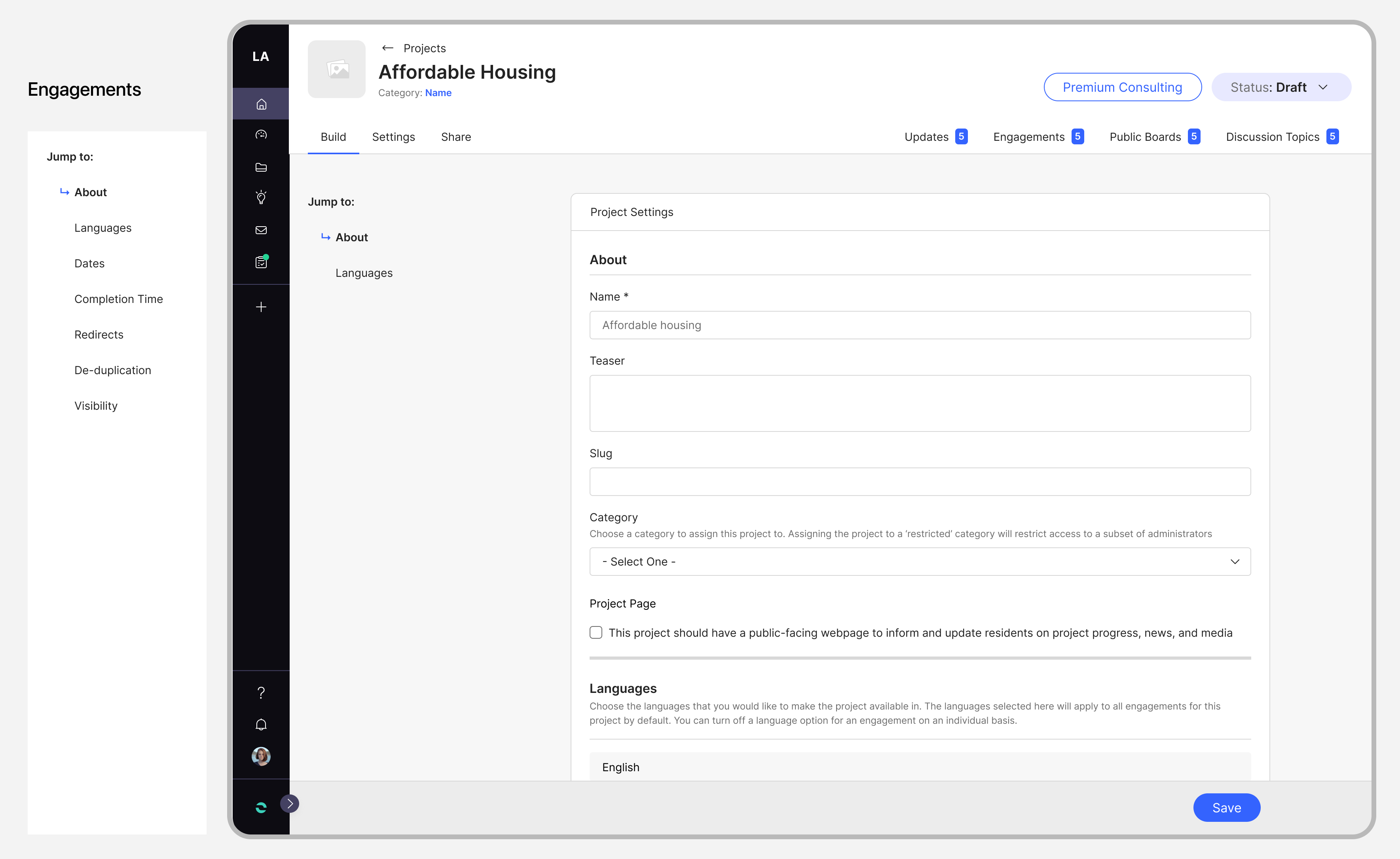
Settings
- ‘Jump to Navigation’ for the settings page to help streamline user access to critical sections with a consistent pattern shared with the other builders.

While the project is still in development, we anticipate a 50% reduction in clicks for creating new activities, improved navigation clarity, and enhanced overall discoverability. These improvements are expected to contribute to increased adoption for Engage on the Zencity platform.
Selected Works
Diablo ImmortalsEvaluating the current player experience
Call of Duty - MobileD1 Retention Analysis
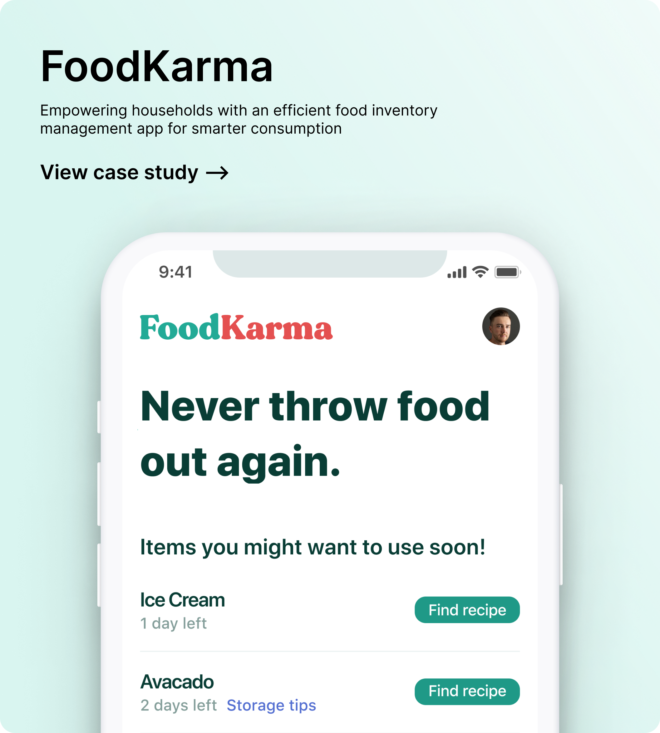
FoodKarmaFood waste management app
(OLD) Zencity - EngageRedesigning the whole project building experience
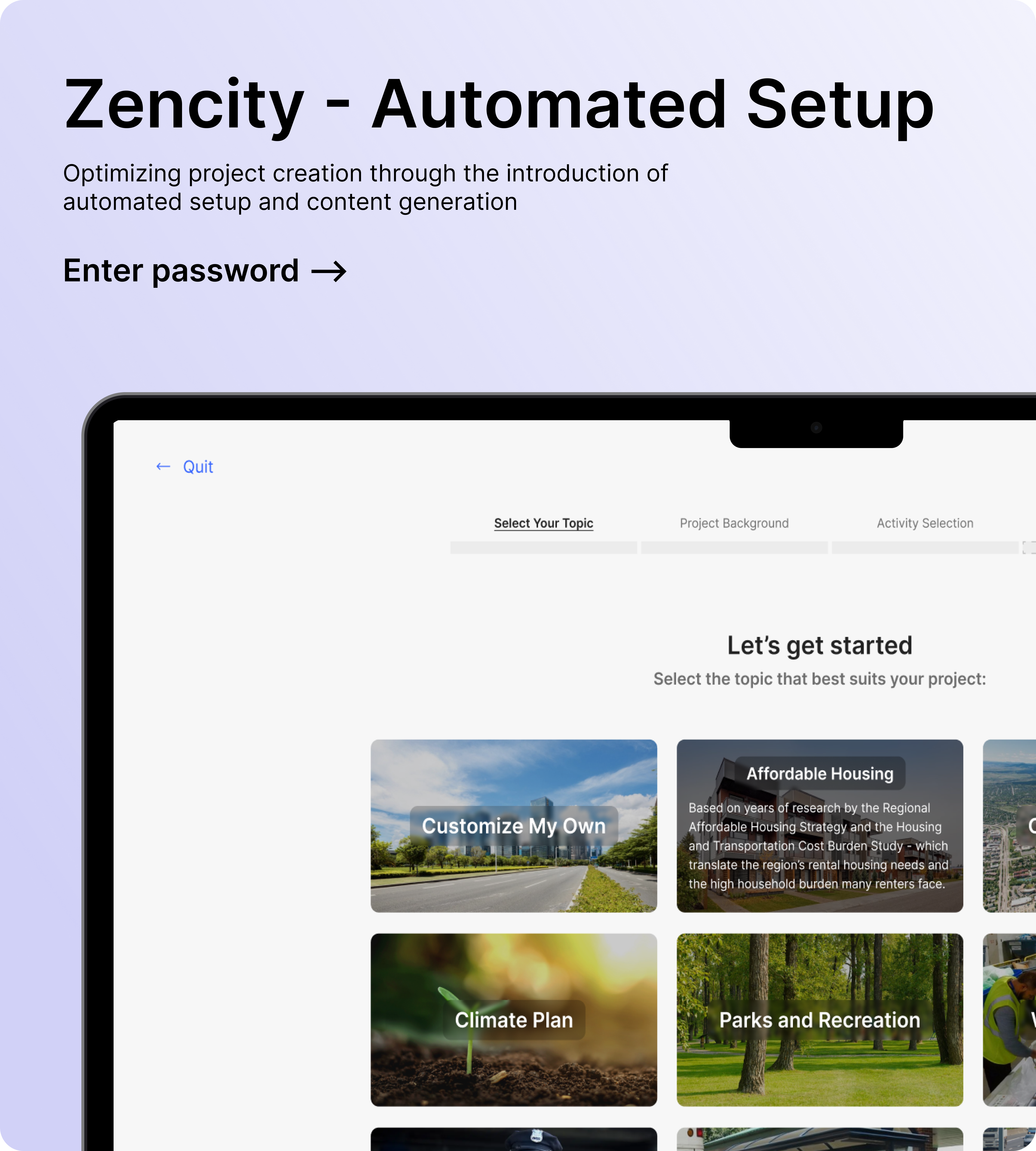
Zencity - EngageAutomated setup for Engagements
Zencity - Engage: BuildersRedesigning the whole project building experience